Mobile Photography – The New Apple iPad Pro Review for Photographers
We’re delighted to publish, Austin Mann’s review of the new Apple iPad Pro from a photographers perspective. Mann is currently working from Iceland on a couple of art commissions and leading a private workshop and he took along the new iPad Pro to integrate it into his mobile workflow. He’s done just that in this article and given us an insight into his new mobile workflow as well as including a few helpful tricks and useful buying advice. Don’t miss this!
To read this alternatively on Mann’s website, please go here.
(foreword by Joanne Carter)
“I’m here working on a couple of art commissions and leading a private workshop and I brought the new iPad Pro along to better understand how it can integrate into the mobile photographer workflow. How does it work to ingest, backup, edit, and share images?
The art installation I’m working on is extremely large format (up to 50 ft. wide), so I’m shooting most of this project with the Hasselblad H6D-100c (a 100-megapixel beast). Needless to say, it’s been a great camera to test the speed of this new iPad Pro”.
How will this new tool improve my work?
The first time I held the iPad Pro 12.9”, I had to confirm with the demo’er that this indeed was a 12.9”. I was halfway convinced they’d handed me the smaller one because it felt akin to the 10.5” I use regularly. From that first moment on, it’s been a pleasure to both hold and view the new 12.9” iPad Pro. The same Liquid Retina technology I wrote about with iPhone XR is used, and it’s even more impressive at scale.
One of my favorite things about iPad has always been how elegantly it showcases photographs. When displaying an image full screen, it basically transforms into a big, beautiful digital picture frame, ready to pass around a group or rotate 180° to show a friend across the table. Now without a home button on the new iPad Pro, there are literally no buttons, no controls, absolutely nothing except your photo on screen, and they look better than ever on this vibrant Liquid Retina display.
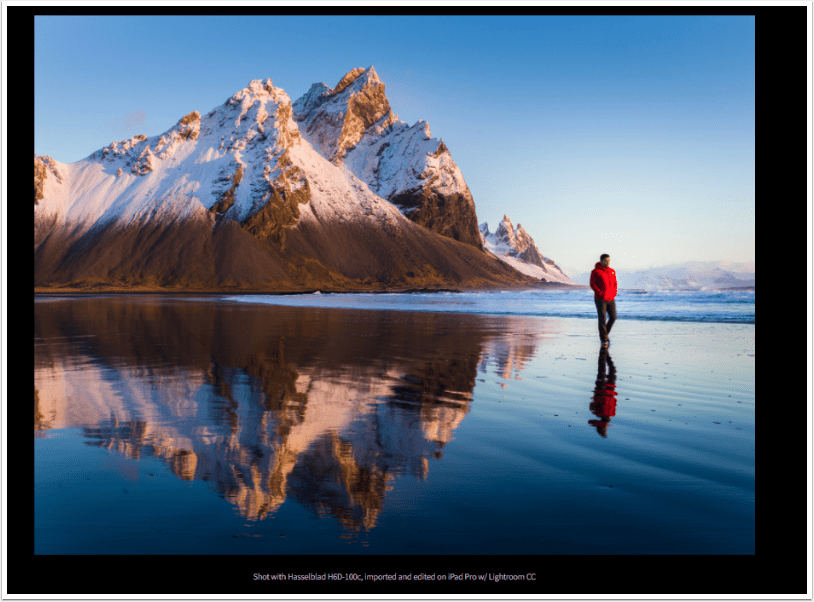
From a photographer’s perspective, I’m always encouraging others (and reminding myself) to share work more often. It’s easy to shoot, shoot, shoot and not share, but leveraging tools like iPad Pro make the process of sharing easier, more fun, and better all around.
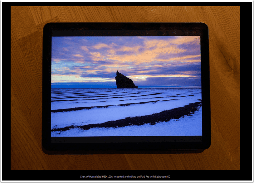
The New Apple Pencil
I’m super into the new Apple Pencil.
My only complaint about the original Pencil was the awkward charging method. I always felt I was going to accidentally snap off the Pencil inside the Lightning port when it was sticking out of the end charging (though I never did).
That said, the team at Apple has really improved the Pencil a bunch of ways: magnetic charge and sync is by far the biggest change and it means your Pencil will basically never be out of charge again. Double-tap to switch to eraser is quite handy, I dig the no-roll design, and the matte finish is a nice touch too.
How does Apple Pencil impact Photographers?
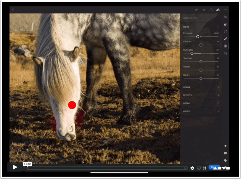
When I’m editing, I’m always looking for ways to tweak four elements of a photograph: brightness, color, clarity, and contrast (BCCC). The trick to great editing, for my style, is to be subtle and natural, not to edit in such a way that the viewer looks at the image and thinks “this looks like it’s been edited.” Instead, the goal is for the viewer see the image, emotionally connect to the subject, and never even think about whether it’s been edited.
Using the Apple Pencil means I can make very natural yet precise adjustments to BCCC, with organic, free-flowing movements instead of lasso selections or mouse-controlled brush strokes. This is why world-class retouchers have been using Wacom tablets for years, and now with the new iPad Pro, iOS 12, and new software from Lightroom CC all together, we can easily and quickly make natural edits like these on-the-fly.
I’m also keenly aware my images actually look different than they would if I edited on my Mac—not better or worse, but different. The tools have a major impact on the process and I find myself expressing myself differently as an artist through iPad Pro. I’m curious to go back and edit some of my older images to see how they’re impacted by these new expressions.

Powerhouse Workflow, Anywhere
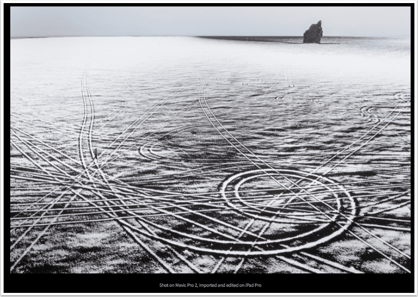
I was working with Mavic Pro 2 in the black volcanic deserts of south Iceland. While sitting in the car (in the middle of the desert, in the middle of nowhere), I decided to offload my images and review them.
I pulled out the iPad Pro and a card reader, and within only a few moments I was reviewing them on screen. Next thing I knew I was editing them with the Pencil in Lightroom CC and then I shared one with my wife—all within just a few moments.
It’s really easy to sit just about anywhere (even with a steering wheel in your face) and not just use it, but use it to its full extent. Another cool feature in this scenario is eSIM. Because the iPad Pro is connected to cellular, even in the middle of nowhere Iceland, I could quickly share the images without even thinking about my connection, WiFi, hotspots, etc. Time wasn’t mission critical on this shoot, but in a scenario where time is of the essence, this kind of workflow could be a game-changer.
—
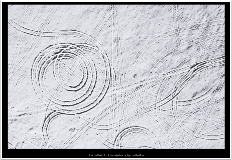
But here’s what is most interesting about this change in process and how it affected my final image: After reviewing the first image (below) on the large iPad Pro screen, I realised it really looks like a black and white image and no one would believe me if I told them it’s actually unedited and shot in full color. (It is full color and what you are looking at is black volcanic sand, dusted with snow, and car tracks.)
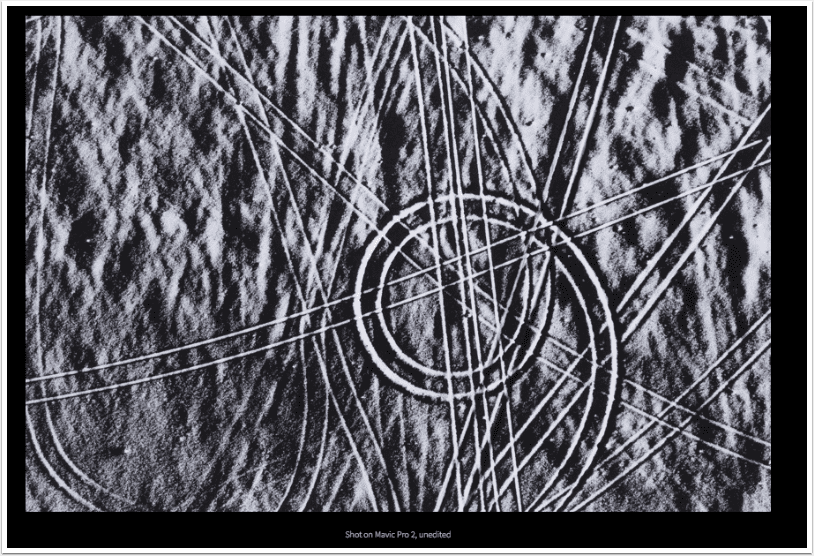
So then I sat there in the car, contemplating how to add depth, color, and contrast to this image. That’s when I decided to add myself to the shot. (See below for the next shots in the sequence.)
First, it’s important to note I very rarely dump and review images in the field with my MacBook Pro, but working with the iPad Pro in this way proved really helpful. I interacted with the image in a different way and it fundamentally changed my final image.
The Mobile Photographer’s Workflow
Working with the Hasselblad H6D-100c, I’m shooting to both SD and CFast cards. With this uncommon camera and media format, I was optimistic but genuinely curious if the iPad Pro would support a CFast reader and these RAW files.
I got a ProGrade USB-C 3.1 CFast Reader and plugged it straight into the iPad Pro holding my breath. Sure enough, it worked seamlessly and I was importing files in no time.
I don’t have the previous model iPad Pro to compare speeds, but the image import process is significantly faster than what I’ve experienced in the past by a LONG shot.

My current process for importing photos into iPad Pro is:
- Shoot. H6D, Mavic Pro 2, iPhone XS.
- Import. Connect USB-C card reader to iPad Pro. Select images to import and album destination in Photos app.
- Select & Edit. Open Lightroom CC where new images from my photo feed have already been added. Make selects with Review module of Lightroom CC, then make edits in Lightroom CC using the Pencil.
- Share. I’m always online with an LTE connection, so shooting off an image via Messages or uploading to Box on-the-fly is no problem.
It’s Really Fast
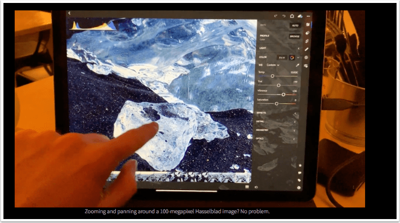
The Hasselblad I’m shooting with (H6D-100c) captures 100-megapixel images. Each RAW file is 216MB (about 7x the size of a RAW file from a Canon 5D MK IV). Needless to say, these files are HUGE and if the iPad Pro can handle them, it can handle virtually any RAW image.

I’ve found the import process via USB-C to be significantly faster than its predecessor, but where the speed really shines is processing the files.
I’ve been editing/writing here in a restaurant in Vik, Iceland, and here’s a quick demo I did with an image to show you how fast this thing is:
Three Wishes
While the new iPad Pro is a massive step forward for photographers looking to use it as the center of their mobile workflow, there are still things I’d like to see improved moving forward.
- I wish there were more batch capabilities on iPad Pro. (For example, Lightroom CC allows me to copy edit settings, but only paste them to one image at a time.) Tasks like batch file renaming and batch custom resizing are important aspects of the pro photo workflow. I’m hopeful to see features like these in the near future.
- I wish the iPad Pro handled external storage differently. Options like Gnarbox and DJI CoPilot are really helpful, but I wish I could plug my USB-C storage into the iPad Pro and operate directly from there.
- I wish there was Dark Mode for iOS. I almost always operate in Dark Mode on Mac these days. I was working in Ulysses Dark Mode on the night flight to Iceland and was temporarily stunned when I switched to Settings.
A Few Helpful Tricks
I’ve spent quite a few hours with the new iPad Pro over the last few days and learned a few helpful tips for the mobile creative pro.
- When using the keyboard, just double-tap the space bar to immediately unlock iPad. First tap turns on the lock screen, second tap authorises with Face ID. It’s super fast and I’ve been doing this frequently.
- Now you can take a screenshot like you do on your Mac (Command-Shift-3). You can even use Command-Shift-4 to immediately jump to the edit/share screen and skip saving it, much like Command-Shift-Control-4 works on your Mac.
- Hold the Command key to see all the keyboard shortcuts in the active app. It’s a great way to discover a bunch of features and possibilities inside your app. (This is not a new feature, but still very useful.)
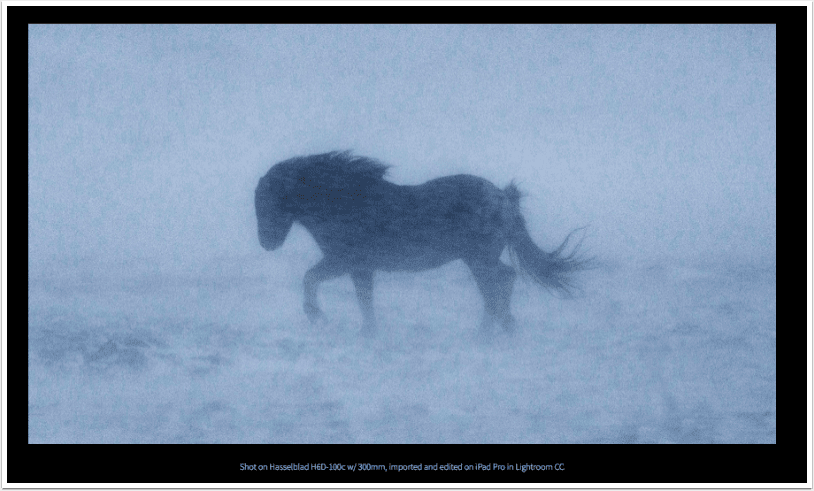
Buying Advice for Photographers
> Get the 12.9”. Personally, I’ve been carrying the 10.5” since it came out. While I loved the massive screen of the previous 12.9”, it just felt too large and heavy and the 10.5” felt right. Now the new 12.9” actually feels much more like the older 10.5”, but with the massive screen I love. When holding it, it feels compact and it’s hard to believe it’s the 12.9”. It’s the best of both worlds.
Having the extra screen real estate is super helpful for culling and processing images (and watching Netflix on the airplane, too). If you’re on a limited budget, I’d focus your investment in the screen size before anything else.
> Go with max capacity if you can. If you’ve maxed out the display and still have budget, I always advise to get the most storage you can because you can’t upgrade it later. Making this choice now means you’ll have more storage later, and ultimately the device should last you longer.
I’ve been treating my iPad Pro as my A Drive and backing up to DJI CoPilot as the B Drive. This means I have a 1TB A Drive, and being able to carry my library around with me locally on iPad Pro is really nice.
> Get the Apple Pencil. I like and use the iPad Pro often without the Pencil, but you’ll really unlock some of its unique power with the Pencil. As I mentioned earlier, I’ve found myself expressing my artistic vision in different ways than I would when editing on my Mac. That’s primarily because of the Pencil.
> Get a USB-C card reader. Apple makes a great USB-C reader, but there are a bunch of great USB-C readers out there. I’ve been using the ProGrade and it’s super fast.
> Consider Gnarbox + DJI CoPilot. These are both great backup solutions, designed to dump on-the-fly and sync with iOS devices, skipping the laptop altogether. The iPro Pro alone can handle most digital workflows, but if you want super fast dumping, data redundancy on separate drives, and more options, then definitely check these tools out.

Hello again, please donate…
We have a small favour to ask. More people than ever are reading TheAppWhisperer.com and we could not be more excited about that. We specialise in mobile photography and mobile art and we value all of our readers, writers, contributors and viewers but we do have costs and we do need to ask for your help. We at TheAppWhisperer spend many hours each day, each week and each month to bring you this high quality level of journalism. We do it because we are passionate about it and because we want others to be as passionate too.
If everyone who reads our website, who likes it, helps to support it, our future would be so much more secure. Please help us by offering a contribution or supporting us with a monthly donation of your choosing.
[seamless-donations]

