iOS Photography Tutorial – Hallows Eve, and a Two-Year Celebration by Jerry Jobe
We are delighted to publish our latest iOS Photography Tutorial by Jerry Jobe. This week Jerry topically writes about Hallows Eve, an app you will most likely want to utilise this coming weekend. Jerry is also marking a two year anniversary of tutorial writing and we have linked to the apps that we have published at the end of this article. Jerry has been incredibly busy and we are sure you’ve all enjoyed each tutorial immensely, we certainly have, they represent an invaluable archive, thank you Jerry. (Foreword by Joanne Carter).
Hallows Eve retails for $0.99/£0.69 and you can download it here
“On November 7, 2012, I published my first tutorial on Hipstamatic. As I approached the anniversary, I had a request from The App Whisperer site, which also publishes my tutorials (since late July 2013) to do a large set of tutorials in the new app Pixelmator. That will follow in ensuing weeks, but I needed to mark the anniversary first; therefore, I am “celebrating” a bit early. At the end of the article you will find a list of the apps I have covered in the last year. You’ll find that my weekly tutorials have resulted in fewer than 52 apps covered. That is because I had several multi-part tutorials, several procedurals, and quite a few additional tutorials on apps I covered the year before, such as iColorama and Paint FX.
Last year on the anniversary I covered major changes to several apps, because those updates, while not making the tutorials obsolete, required additional explanation. Snapseed, Big Lens, and the Brain Fever apps like LensLight and LensFlare had changed substantially in 2013. There were no major updates among the apps I’ve covered in 2014, so instead I’ll talk about Hallows Eve, a new entry by JixiPix that you might get a chance to use in the next few days before the holiday is upon us.
Hallows Eve is not a subtle effect; but by judicious use of blending in other apps a subtle effect can be achieved”

JixiPix has been working hard to make their user interface consistent across all their apps, and Hallows Eve uses that same interface. At the top left is a backward arrow used for undo; the dice at the upper right is for randomizing the effects. The white bar near the bottom is the top menu; the bottom dark gray area is the options for the item selected in the top menu. Below you’ll see that the only options available before loading an image are Get Photo and Info.
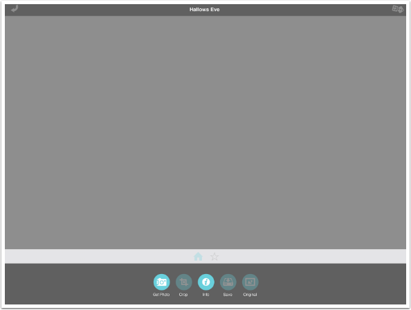
The Info button takes you to their help page on the web. This is opened within Hallows Eve itself, not in your browser. Scroll down read more and see ads for JixiPix’s other apps; tap Done when you want to return to the app.

When you load an image, you are taken to the Home menu selection (the little blue house). This contains Crop, Save and Original options in addition to the Get Photo and Info options already discussed.
A default effect is applied when you open the image. This default effect includes Details and Clouds, which affect the entire image. It does not include Objects, such as ghosts, tombstones or text – those are added in Presets or Objects.
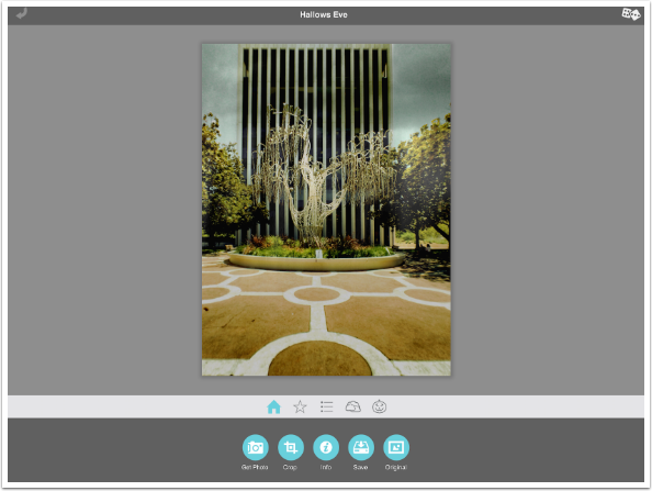
Tapping Original will show you the original image, which in this case is a midday photo of a tree sculpture in Palo Alto, CA. I’m using a midday image to show you that Hallows Eve’s effects are strong enough to turn a bright image into something sinister.
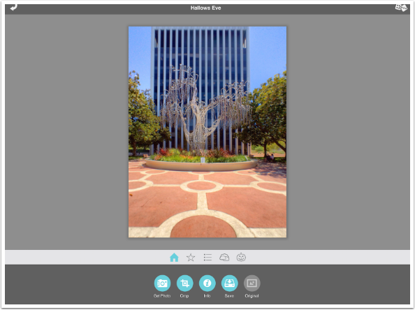
Tapping the Randomize icon in the upper right affects the Details and Clouds settings. Once again, it does not add or change Objects placed in the image.
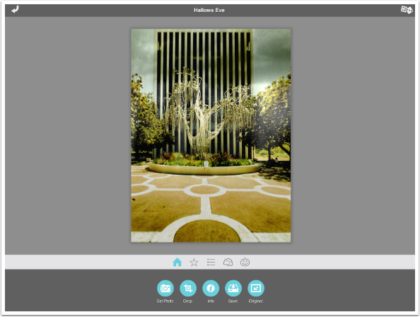
The Star icon on the menu bar is the Presets option. Hallows Eve has 16 different Presets that come with the app, and you are able to add your own. Presets are a combination of Details, Clouds and Objects that can jump-start your sessions. Presets are fully adjustable, and you can apply a preset and then add, delete or move Objects.
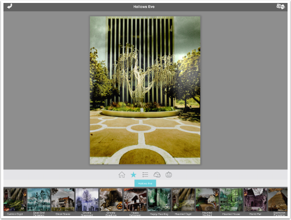
Below I’ve added the Scarecrow Pumpkins preset, which has added (by my count) five objects.
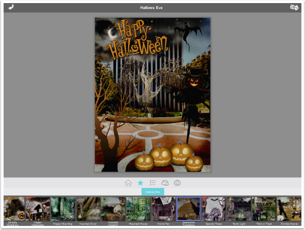
Just by tapping the Torch Light preset, I’ve changed the look of the image entirely. I would probably delete the flying bird from this, as it doesn’t say spooky to me. The vulture that ends up on the fountain is a little much, as well.
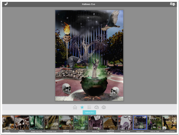
If you like the Details (tone) and Clouds settings from the Preset, but want to completely redo the Objects, you can do the by tapping the Pumpkin icon (Objects).
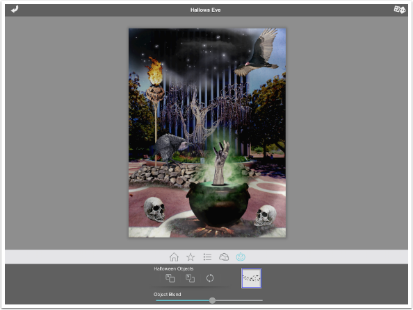
The icon down in the dark gray area that is two arrows in a circle is the Reset Objects button. Tapping it clears the objects entirely, as seen below.
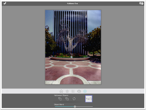
It is probably easiest to adjust the tone and clouds before adding objects, so I first tap the icon in the menu bar that looks like three dot-dashes. This is the Details menu item, and shows three options: Tone, Darken Scene, and Contrast. Tone is a slider and a color picker, which controls how the image is tinted.
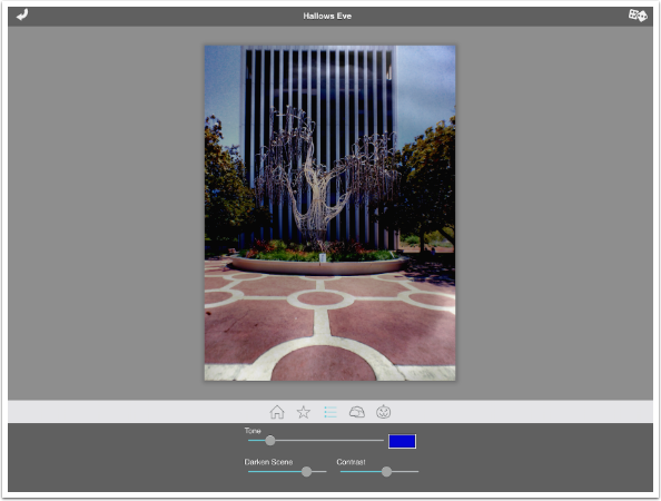
Below I’ve changed the color to a brown from the bright blue, and increased the amount of tinting with the Tone slider. I’ve also made the scene darker by increasing the Darken Scene slider and the Contrast slider.
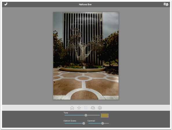
The Cloud icon on the menu bar displays two options: Cloud Strength and a list of Cloud textures. There are 20 Cloud textures to choose from
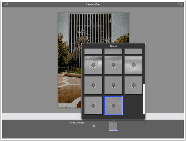
I chose texture 14 and increased the strength. It’s looking very gloomy indeed.
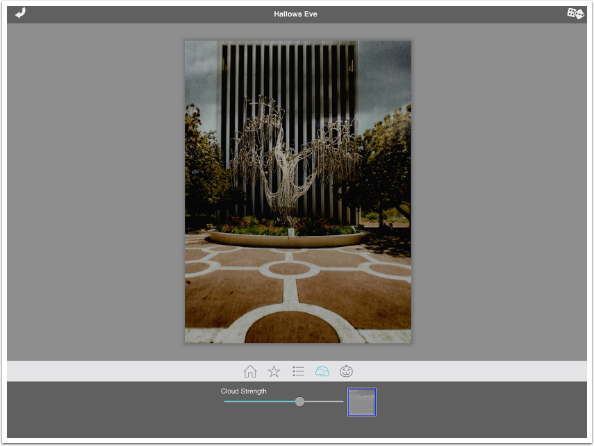
Below I’ve tapped the Pumpkin (Objects) icon again and tapped the thumbnail to choose among the over 130 different items included. As you select an item from the list, it is added to the image and the picker disappears.
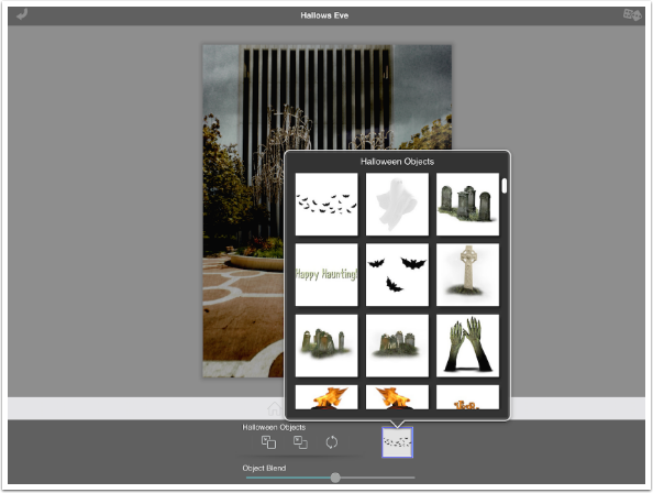
The object is placed somewhere on the image with a bounding box surrounding it. The X at the top center of the bounding box deletes the item; the four corners resize and rotate the object; and the center dot moves the object.
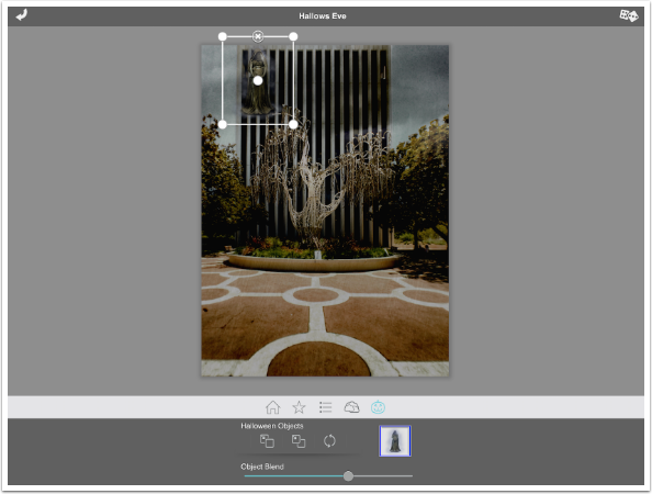
Below I resized the ghostly figure using the corners and moved it using the center dot.
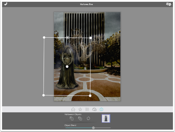
I added some rocks next and placed them in front of the fountain. (Please ignore the Volume control; sometimes I hold the iPad strangely when taking screenshots.) The rocks cut across the front of the figure!

We already discussed the Reset All Objects button above. The other two buttons, from the left, are Move Up and Move Down, respectively. I tap the Move Down button and the rocks move behind the figure.
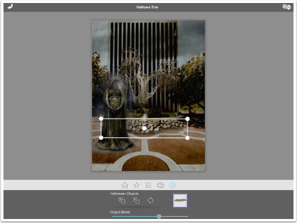
The final slider is Object Blend. This determines how much the Details sliders (Tone, Darkness and Contrast) affect the object. Below I’ve added a tree and moved the Blend slider all the way to the left (off). Then I deselected the object so you could have a look undistracted by the bounding box. The brown Tone and high Contrast are not added to the tree object.
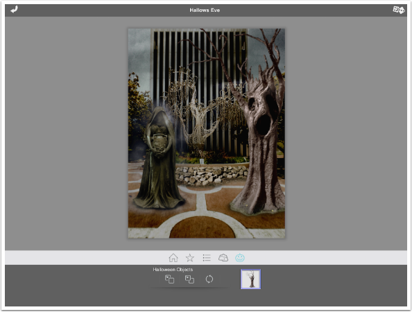
I reselected the tree, pushed the Blend slider all the way up, and deselected the tree. Now you can see a brown tinge and there’s more contrast.
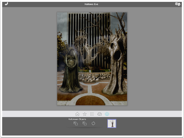
After adding a text object, I’m ready to save the image. I do that by tapping Home on the menu bar, then Save in the options. I save to the Camera Roll, and I also have the opportunity to save the edits as a Preset.
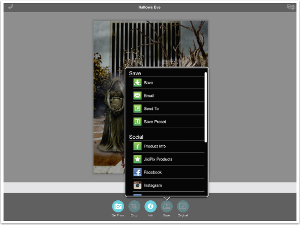
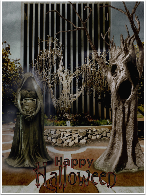
And here’s my completed image. The effects, as I’ve said, are rather intense, and could probably be helped by texturizing in a grunge app like Distressed FX or Stackables to draw the elements together.
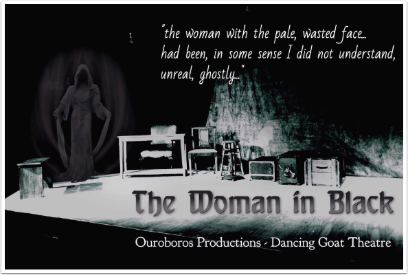
As I said when we started though, blending the image with the original can produce more subtlety. My last image is one of the set of my most recent acting stint, taken in Provoke. I added the figure in Hallows Eve, then blended it back with the original and added the text in iColorama. The figure is just visible, and suitably eerie. Enjoy!
Look for an in-depth look at Pixelmator starting next time!
These are links to all the app tutorials I have covered in the last year, in alphabetical order:
- 645 Pro MK II
- Background Eraser
- Blur
- ColorLake
- Deco Sketch
- Distressed FX
- Dramatic Black and White
- Etchings
- Flood
- Fragment
- LayerPic
- Lo-Mob
- LoryStripes
- Matter
- Mobile Monet
- Painted Camera
- Paper Camera
- Pencil Camera
- Pencil FX
- Phonto
- PhotoCopier
- PhotoToaster
- PicGrunger
- PopAGraph
- Provoke
- Reflect
- RollWorld
- Superslides
- Tangent
- VectorSnap
- Vinylize Me
- XnRetro
- XnShape



One Comment
Astra
Thank you for that .. Found it very helpful .. Was unsure what blending was doing .. At first I thought it was something to do with opacity or blend mode .. Thanks TAW for sharing these