
Mobile Photography/Art Tutorial – Brushstroke Part 1 – A Dizzying Amount of Presets
We are delighted to publish Jerry Jobe’s latest mobile photography/art tutorial for our reading and viewing pleasure. This week Jobe takes a look at the popular mobile photography and Art iPad app Brushstroke. This is Part 1 of what will be a two Part series. Read his thoughts as he puts it through its paces (foreword by Joanne Carter).
Brushstroke retails for $3.99/£2.99 and you can download it here
“I’ve covered a few apps that turn your photos into paintings. Glaze has several fine presets, but doesn’t offer a lot in the way of control. Artista Impresso gives you quite a bit of control, but it is over a particular style of painting. iColorama gives you both automated painting, as I discussed in my tutorial on the Auto2 feature last time, as well as the ability to make the strokes yourself (the ultimate control).
There’s always room for one more app, however, trying to hit the appropriate balance of various styles and amount of control. Brushstroke, by Code Organa, falls into the first category, offering only a moderate amount of control over a dizzying number of presets. So my two-part tutorial on this app will not be structured around how you control your output, but comes across more as a sampler of the different styles available. There are many, so let’s get started.
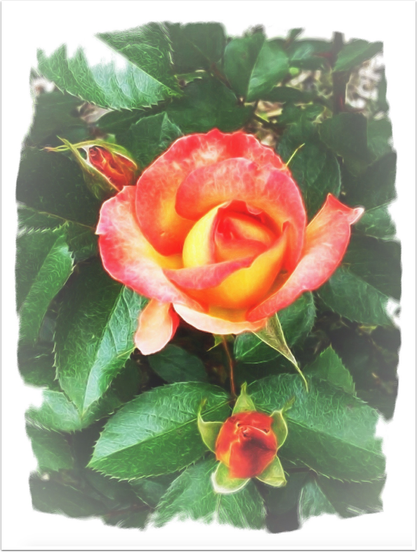
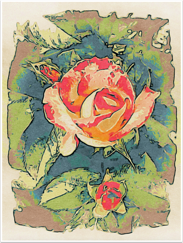
I’m going to work with this flower image, which has already been modified from the original in iColorama. The background foliage has been faded, and a “drawn” border was applied”.
Brushstroke is a universal app, with support for portrait mode only on the iPhone, and both portrait and landscape mode on the iPad. The screenshots are in portrait mode on the iPad.
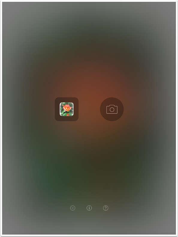
There is no splash screen; Brushstroke goes right into determining the source for your painting: Library or Camera. At the bottom are three small buttons: Settings. Info and Help.
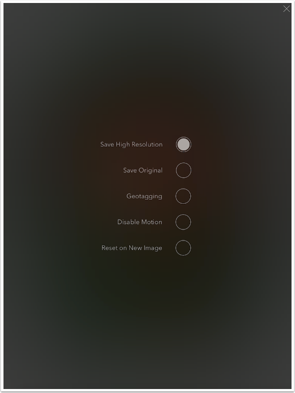
The settings are minimal. The first, in my opinion, should always be set. Save High Resolution allows you to save at the size of the original. Unlike Glaze, it will not expand on a small original.
Save Original and Geotagging deal with images captured with the in-app Camera. As I recommend never using an in-app camera, these settings are useless to me.
Disable Motion deals with some internal animation when going to the Save screen, and should only be turned on if processing power is limited. Reset on New Image controls what happens when you load a new image during a session. The default is to leave all presets – Paint, Color, Canvas, Adjustments – the same as for your previous image. If you wish to reset them all, so that you start over completely with a new image, then turn this setting on.
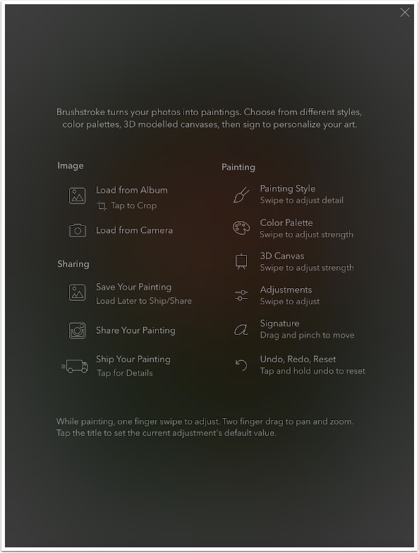
Help is a one-screen, rudimentary discussion of the controls available. This screen should be available while working on an image, not just before an image is loaded.
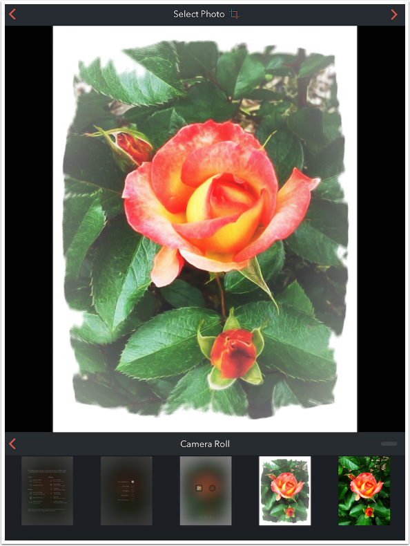
When choosing an image from the library, the Camera Roll is the default album. That can be changed by tapping the arrow to the left of the words “Camera Roll”. The bottom of the screen shows the images in the chosen album, most recent images first.
To select the currently displayed image, tap the arrow at the upper right. To crop the image first, tap the Crop icon next to the words Select Photo.
The Crop screen gives you handles to crop the image.
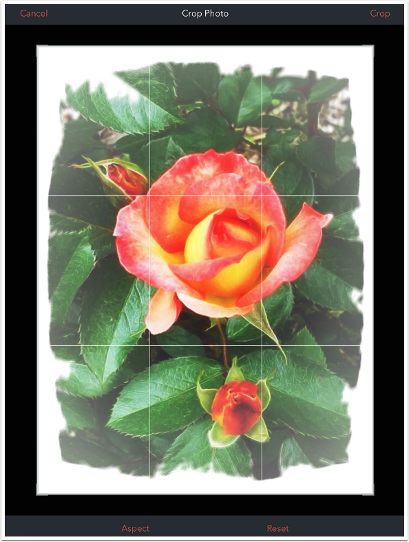
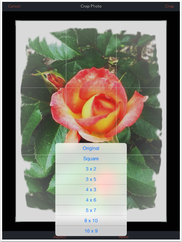
Tapping Aspect at the bottom of the screen gives you a list of different aspect ratios. It should limit the handles to aspect you choose, but I found that moving the handles after choosing an aspect will result in a free-form crop. I would suggest that you not use the crop tool in Brushstroke.
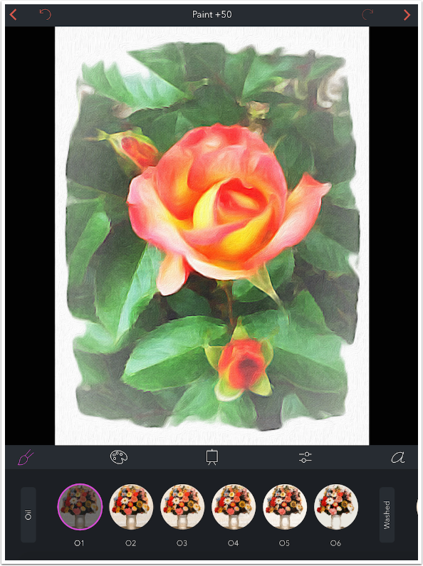
The main workspace is shown below. When you choose an image, there is a wait for the image to be “painted”. The algorithm performed seems to do all the heavy lifting up front; later, changing to a new style does not require a further wait.
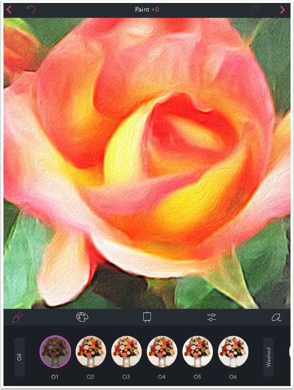
The upper left arrow returns you to the image picker, while the upper right arrow sends you to the Save screen. There is an Undo arrow at the top, and an indicator of the current strength of the type of effect being applied. By default, Brushstroke starts with the Paint adjustment, represented by the brush icon. You will also see icons for Color (the palette), Canvas, Adjustments (the sliders) and Signature (the ‘a’). At the bottom are the available presets for the chosen effect.
I use a two-fingered pinch to zoom in to show you the “painting” that was done for preset O1. You can see why it took a while for the program to produce this.

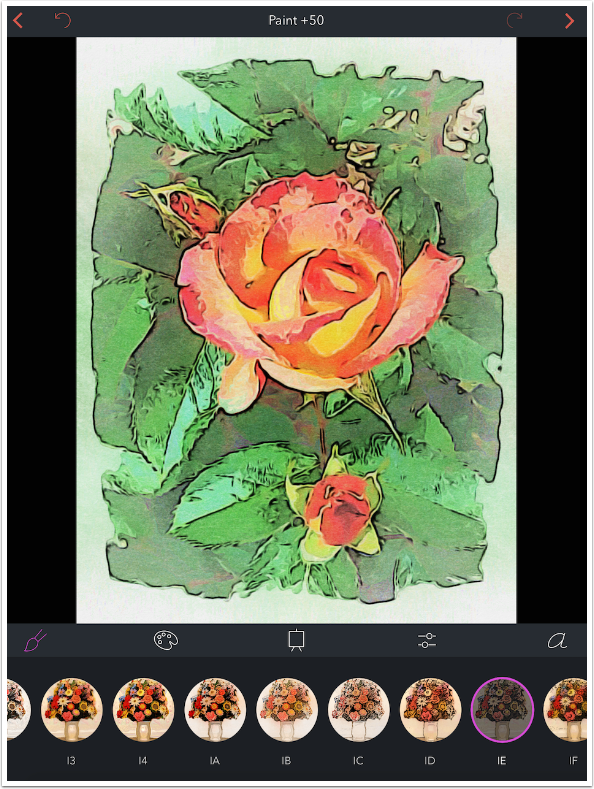
The default setting for Paint is +50, as you can see top center in the image above. This value can be changed using a swipe across the image. Swipe right to increase detail, and left to decrease. A tap on the word Paint will return the setting to +50.
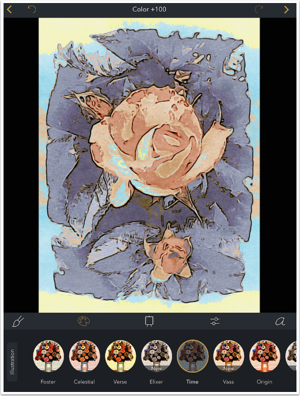
The changes made by altering the detail amount are subtle. Below I’ve increased it to +100, and it takes a keen eye to discern the difference.

Below I’ve reduced detail to 0. If you compare the bottom on the image, below the flower, you’ll be able to tell that there’s a difference between 0 and 100. But is it enough to waste time fiddling with the detail amount? I don’t find it to be.
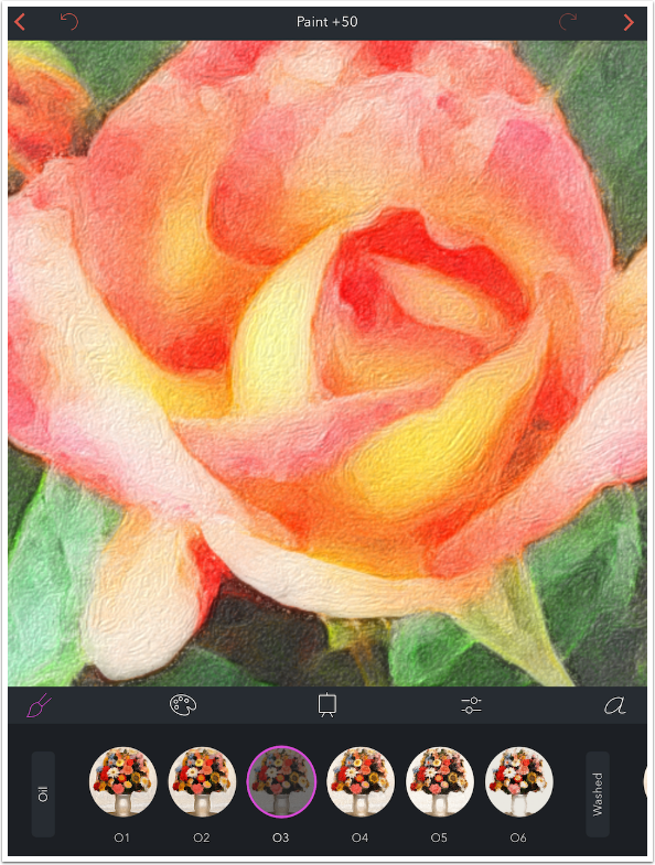
Luckily, there are so many presets available that you can achieve a personal look without the use of the detail amount. Below is preset O3. It’s still an Oil preset, but it gives a completely different look to the image.
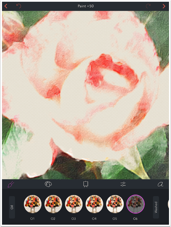
Even within the same group of presets, there are intense differences. Below is preset O6, which washes out the flower. These types of looks I find handy in later blends.
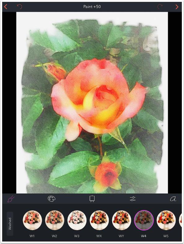
Now we’ll take a look at some examples of the different types of Paint presets. The next group is called Washed, and is a watercolor look. There are eleven Washed presets.
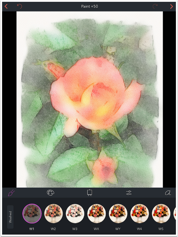
You can still get a significant amount of detail in a Washed preset, as in W4 below.
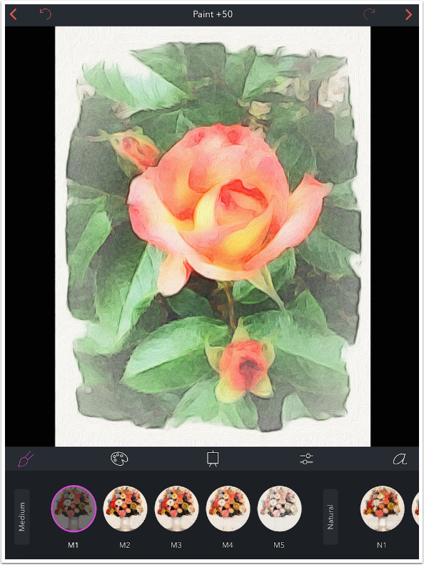
The next group is Medium, with 5 presets.
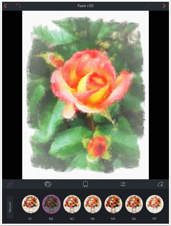
There are seven Natural presets, which mimic natural brushes.
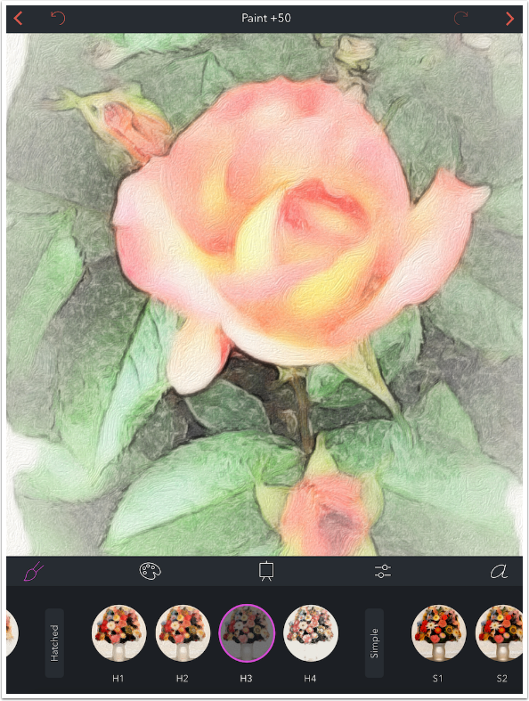
When I saw Hatched, I thought “a cross-hatched sketch”. Instead, these four presets give a hint of a squared-off stroke.
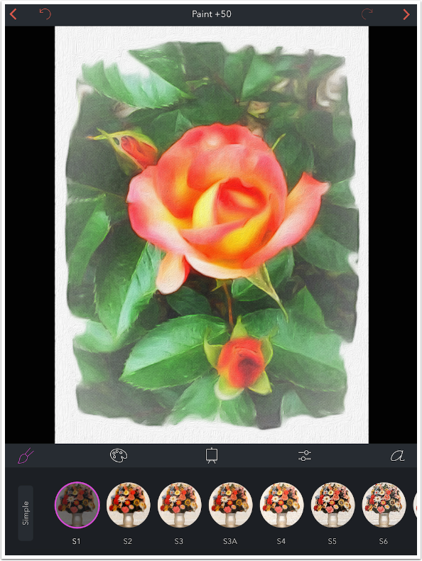
Simple presets do some flattening of the image before painting. There are 8 Simple presets.
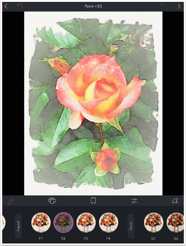
There are four Frayed presets, which produce strong edges.
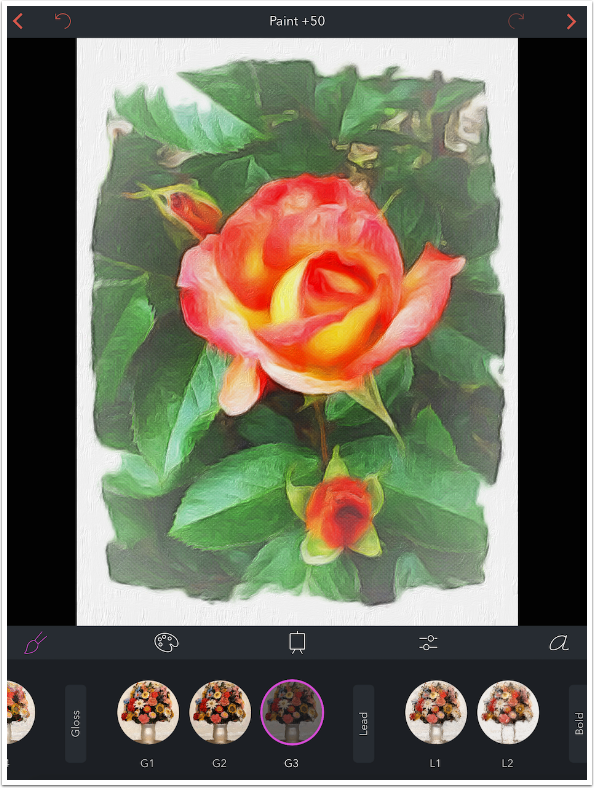
Three Gloss presets really bring out the texture of the canvas. We’ll take a look at Canvases in the next instalment
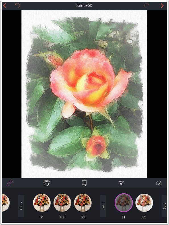
The two Lead presets emphasize both dark and light edges.
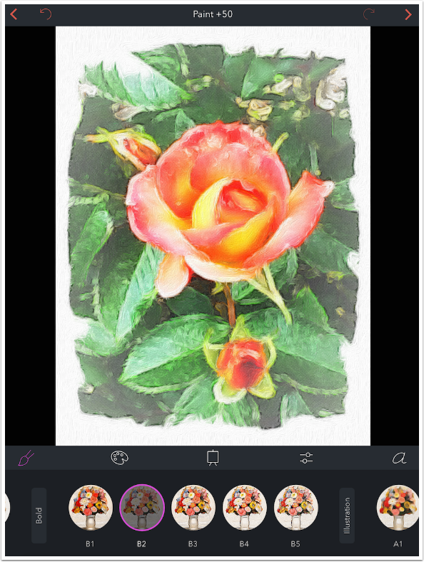
Bold presets produce thick strokes and edges. Below you’ll see one of the five Bold presets.
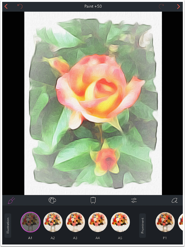
Next is the first of two groups of Illustration presets. There are five in this group.
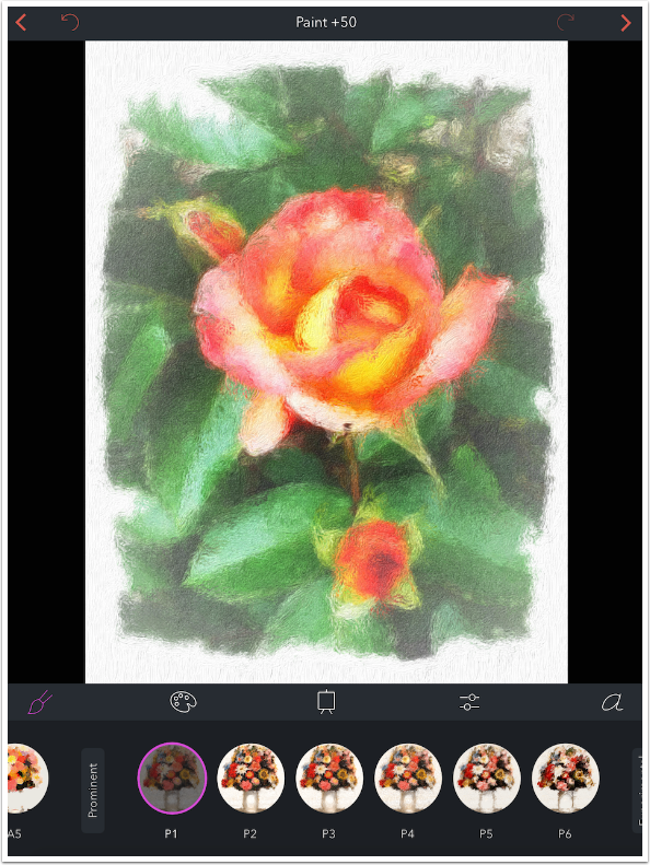
There are six Prominent presets, with rough brushstrokes.
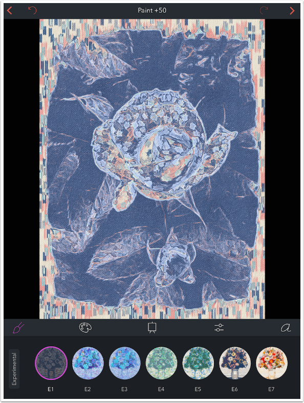
You can really achieve some wild looks with the seven Experimental presets.
The final group is another Illustration group. This second Illustration group is an in-app purchase of 99¢, and it is well worth it. There are 28 presets in this group.
All in all, there are 101 Paint presets, and most of them are useful in one situation or another. If your mind runs, as mine does, to blending and masking different styles or looks, then the possibilities become endless.
But the Paint presets are not the only way to change the look of your painting. The next set of presets deal with Colors, and we’ll take a look at them next.
Color presets are accessed by tapping the palette. They are also grouped. In addition, there is a default preset, Normal, that does not affect the color of the image at all.
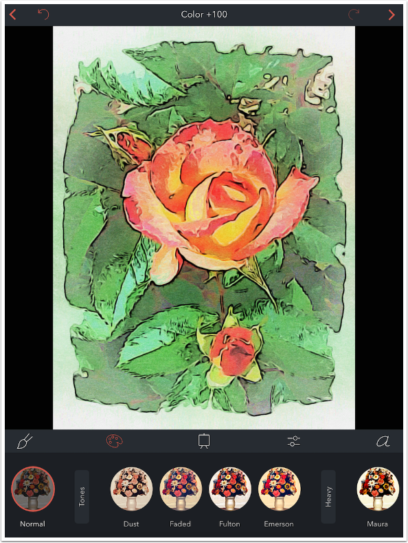
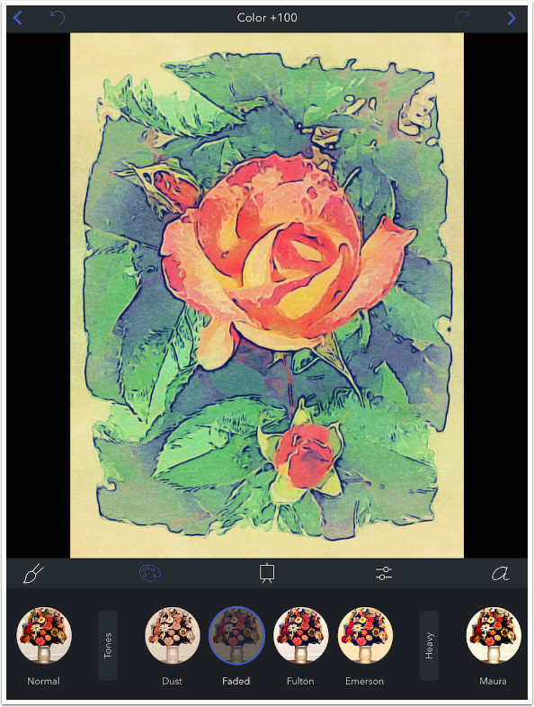
The first group is Tone, with four different presets. Color defaults to a value of +100, as seen below. That is a saturation or intensity value, and not a hue value. Using a swipe to the left to lower the value makes the color duller. It does not remove the tint.
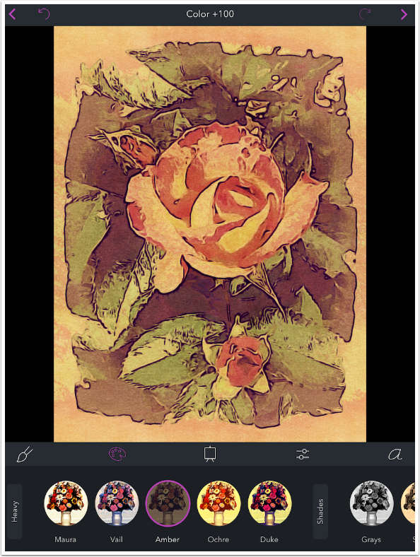
The Heavy presets do some radical re-coloring. There are five Heavy presets.
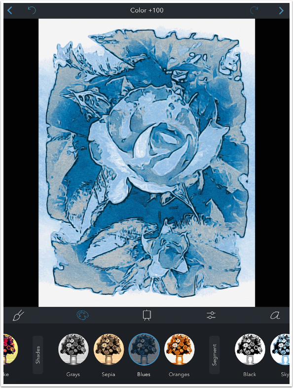
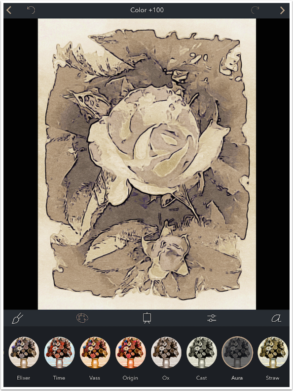
Shades impart a monochrome tint to the image. There are four Shades presets.
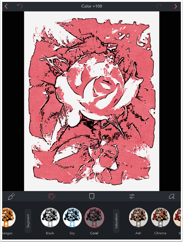
The three Segments presets create a threshold or posterized look before adding a monochrome tint.
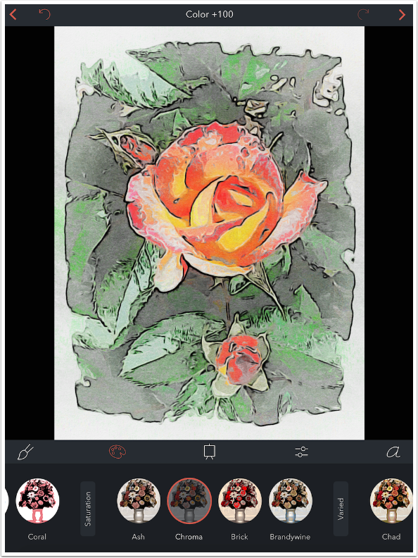
The four Saturation presets make one range of colors brighter while desaturating the rest.
The next group is called Varied, and there are thirteen presets that really mess with your colors.
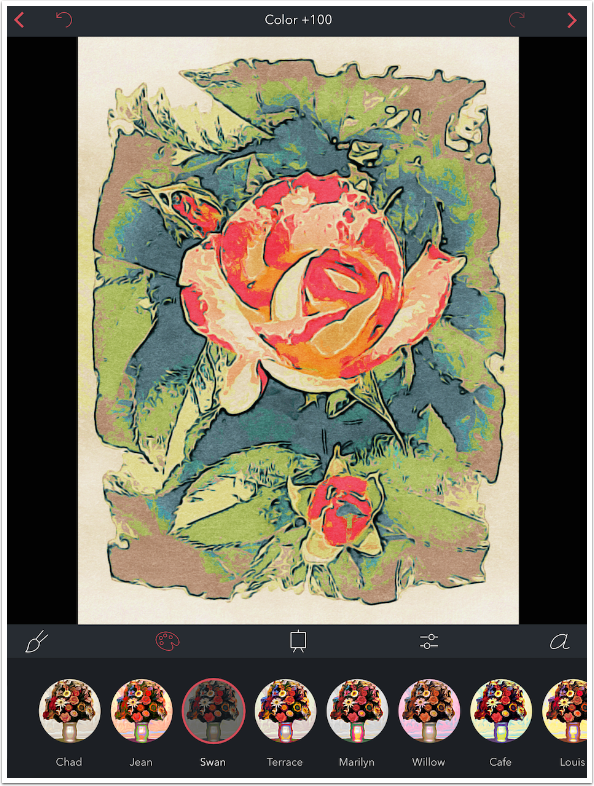
I’m serious, Varied presets will mess with your colors.
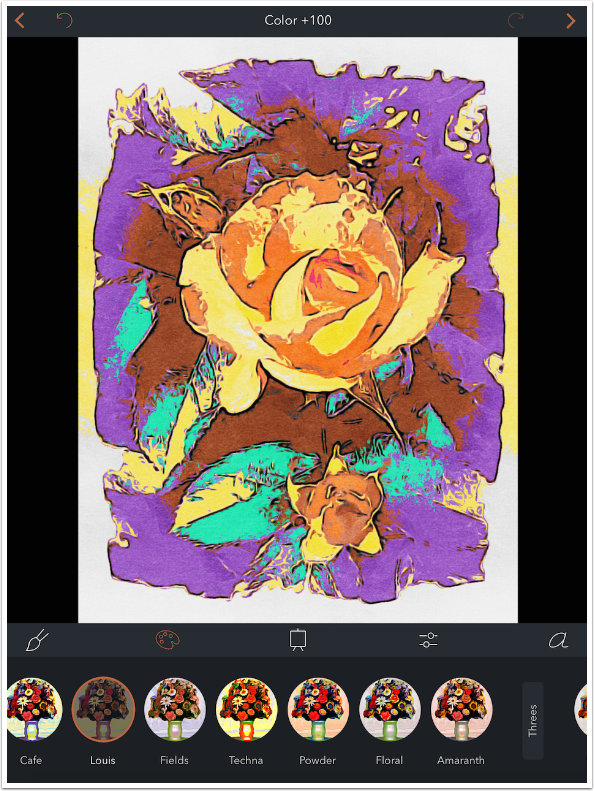
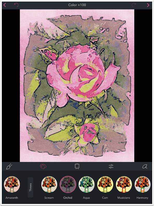
The next three groups will work heavily with respectively, three, two or one color. They will not replace all the colors from the original image, but will be “influenced”. The first preset group is Threes, and has ten presets.
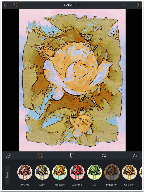
The next group is Twos, and has nine presets.
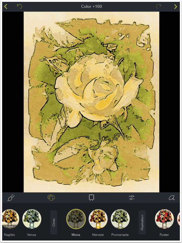
The three presets under Ones run towards the greens and browns.
Finally, there are a set of Color presets that are part of the Illustration pack, and so purchased with the same 99¢. There are 20 presets in the Illustration group.
There are monochrome presets as well in the Illustration group.
So that’s 75 Color presets in addition to the 101 Paint presets. That’s a lot of variety, but we still have a lot to cover in the next instalment. In the meantime, I tap the upper right arrow to go to the save dialog.
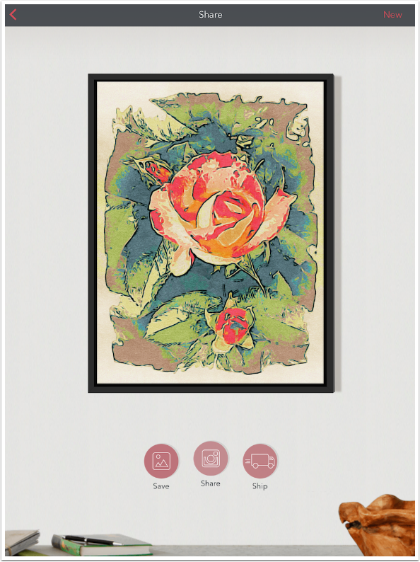
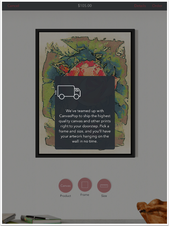
The image is displayed in a black frame and you have the choice to Save, Share or Ship. Save sends the image to the Camera Roll. (If you swipe left and right on the image, you will see the frame change to reflect the different options under the “Ship” option. Images are not saved to the Camera Roll with the frame.)
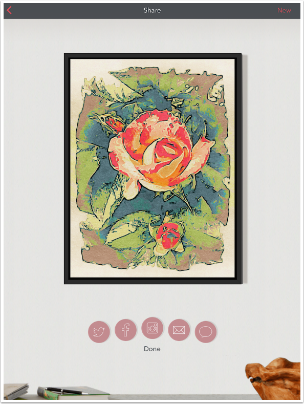
Share allows for Twitter, Facebook, Instagram, email and message.
The Ship option uses CanvasPop to print your image on canvas and frame it. As you can see at the top, the price for the canvas with a black wood frame would be $105. It is not clear if shipping is included.
Options for posters and framed prints are also available, as are different sizes. This image can range in size from 8×11 to 21×28.
One more tip: Brushstroke keeps track of the images it has saved to your Camera Roll. If you save the image and later want to print it, just select the image and Brushstroke will give you the option to edit it or go directly to Share.
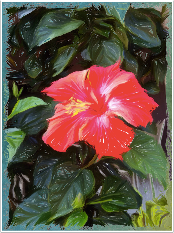
Here’s my finished image. It would certainly be worthy of framing. But there’s more to be done. Stick around for part 2. Until then, enjoy!
Please help us…
TheAppWhisperer has always had a dual mission: to promote the most talented mobile artists of the day and to support ambitious, inquisitive viewers the world over. As the years passTheAppWhisperer has gained readers and viewers and found new venues for that exchange. All this work thrives with the support of our community.
Please consider making a donation to TheAppWhisperer as this New Year commences because your support helps protect our independence and it means we can keep delivering the promotion of mobile artists that’s open for everyone around the world. Every contribution, however big or small, is so valuable for our future.
Jerry Jobe
Never content with just scratching the surface of what an app can do, Jerry Jobe decided to pass on what he learned about imaging apps to others. He’s constantly trying to figure out just what tools other artists have used, and trying to incorporate them into his own work, in an attempt to find his style. He’s written tutorials on over 145 apps so far, which you can find (along with his Song of the Day entries) at http://enthusiasmnoted.wordpress.com/ He lives near Atlanta, Georgia, where he also finds a creative outlet in acting and directing in community theater.
2 Comments
Judy
Have you done part two yet? This is really great.
Joanne Carter
Yes, Judy, here is part 2 – https://theappwhisperer.com/2015/08/mobile-photographyart-tutorial-brushstroke-part-2-canvas-the-area/