Mobile Photography / Art Tutorial – iColorama: Brush Tips #1
We are delighted to publish Jerry Jobe’s latest mobile photography/art tutorial for our reading and viewing pleasure. This time Jobe takes another look at the app iColorama and offers some very useful brush tips. Read Jobe’s thoughts as he puts it through its paces (foreword by Joanne Carter). Take it away Jerry…
iColorama retails for $2.99/£2.29 and you can download it here.
“A few weeks ago, in a conversation about brushes in iColorama, I was asked, “Is there a resource that describes exactly what each function does and how to use it?” My response was, “No. I have several tutorials on Brush settings – one on Artist, one on Plane and Rebound, and one that covers Abstract, Stamped, Colorize, Shatter and Explode, I think – but an overall general Brush tutorial seems to be something I should put together.” (Since writing that, I have also added a tutorial on the Clone brush). NB: Please take a look here for all our previous iColorama articles.
I looked at creating an overall general Brush tutorial, and found it to be an extremely daunting task. Artist brushes have 15 different parameters. Stamped also has 15, but some of the parameters are different. Not only am I supposed to explain all those parameters, but I should have good examples of why I would want to use those parameters. Some parameters make obvious changes on some brush types; others are subtle to non-existent. Worst of all: a laundry list of Brush types and parameters would be extremely boring. I’d have trouble staying awake long enough to write it, and no reader would ever get to the end.
So I decided instead to create a series of “Brush Tips” articles, which will explain certain brush types and some of their parameters. I will try to give these articles some kind of context. Today, I will look into how a parameter gives you capabilities that you may not have realised were in iColorama. Next week, I’ll be describing a painting workflow that I think you’ll find extremely helpful, especially if you wish to return to a painting and work on it further. After that, you can expect “Brush Tips” to be a regular, if intermittent, feature.
This week we are going to look at brushes that can apply color directly to a canvas, with no underlying image: Colorize and Paint. In a first for me, I will be using screenshots from iColorama S, the iPhone version of the app. iColorama is not a universal app. The separate apps for iPad and iPhone match very closely, but not entirely. If features do not match, I will try to point that out”.
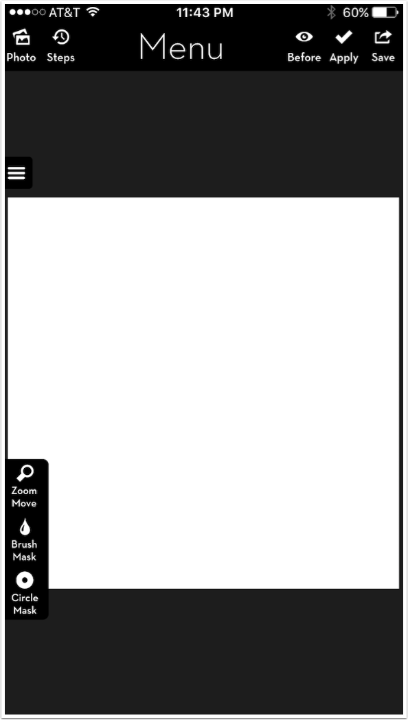
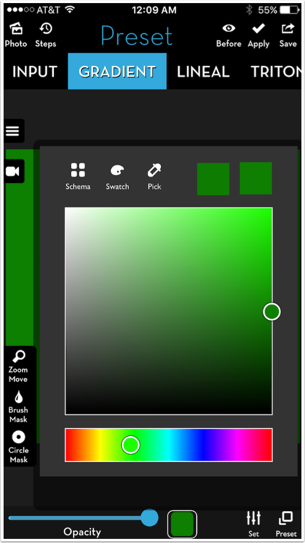
We are starting with a blank square canvas, as seen above. This is an option available when loading a photo (top left). I find a white canvas less than optimal for painting, so I want to create a canvas. Below, I’ve gone into Preset>Gradient and selected Preset 3, which gives a two-color round gradient. I use the two color thumbnails at the bottom to assign the two colors through a picker. Tapping the thumbnail a second time closes the picker so you can see your new canvas.
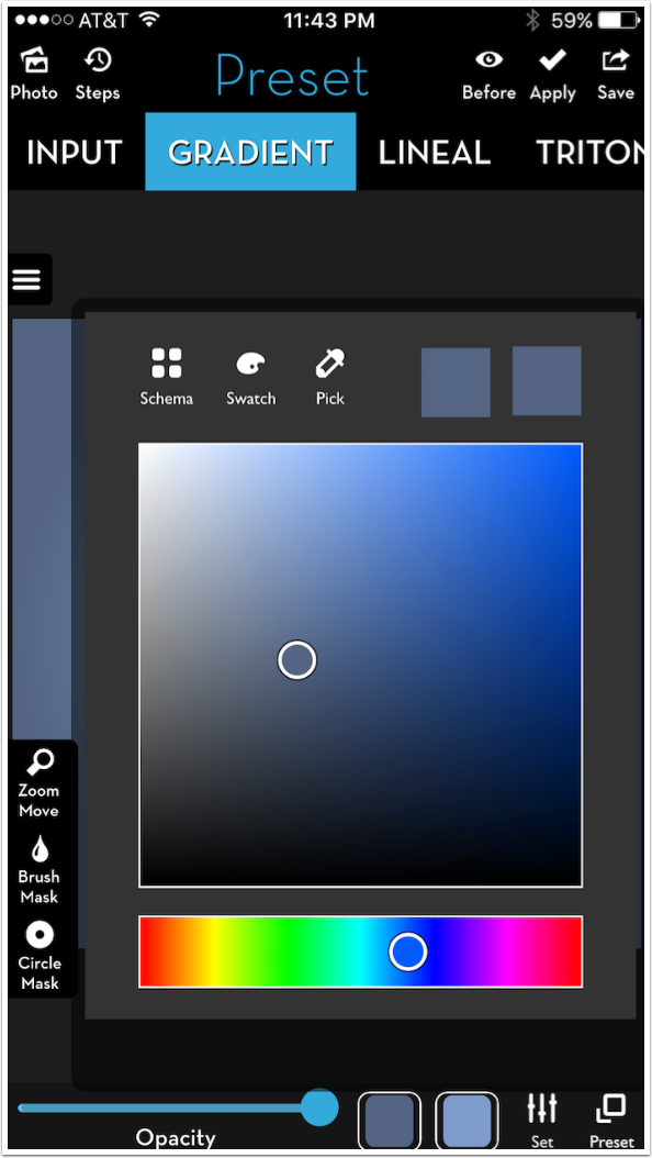
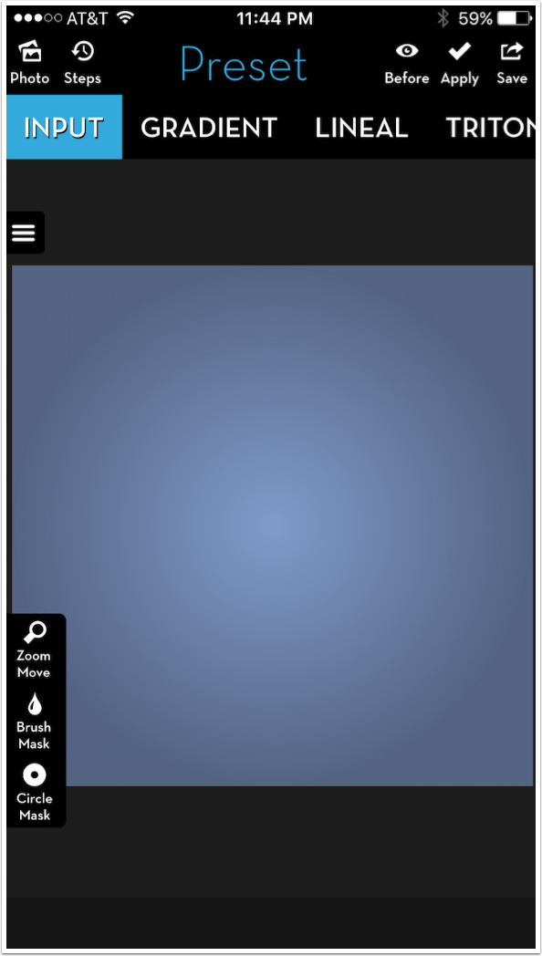
Below is my canvas.
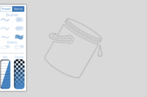
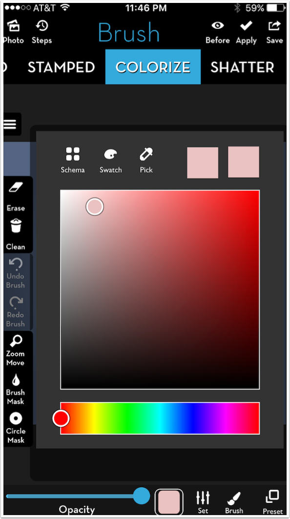
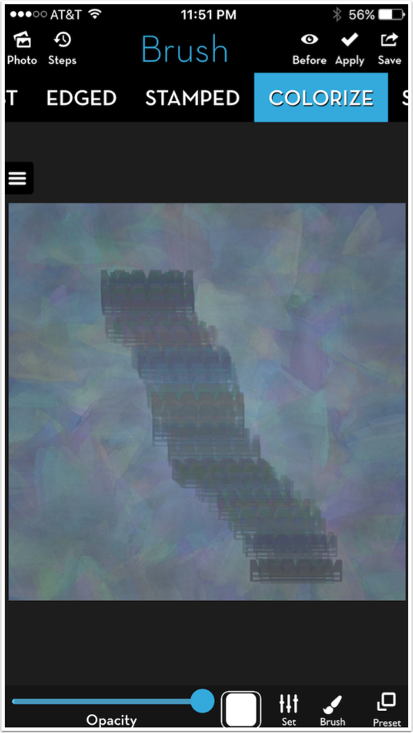
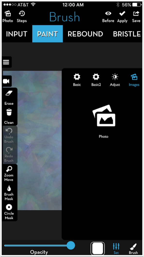
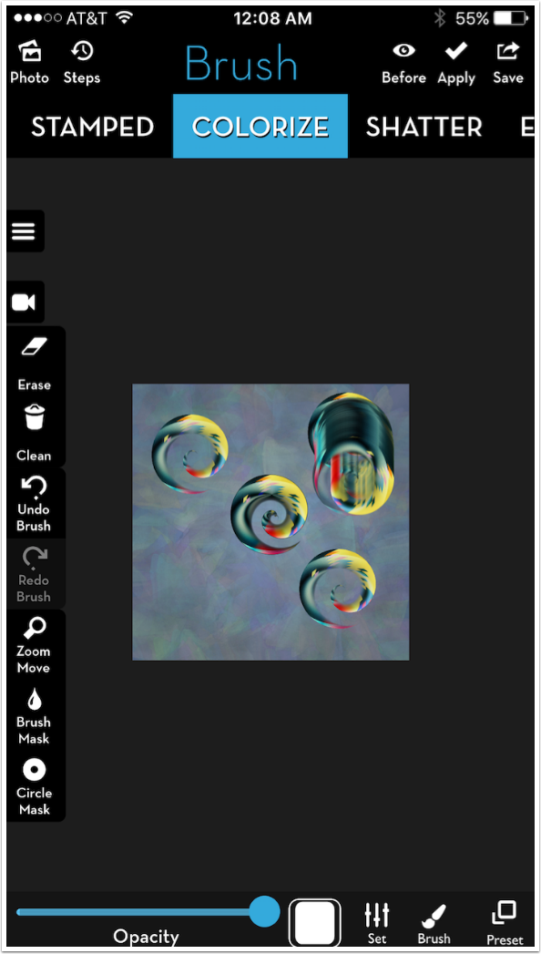
I choose Colorize as my first Brush Type. Colorize can pick up the color underlying your stylus (or finger), or you can assign colors. The first thing I will want to do is “create” my brush, through the use of a brush tip and the parameters found under Set.
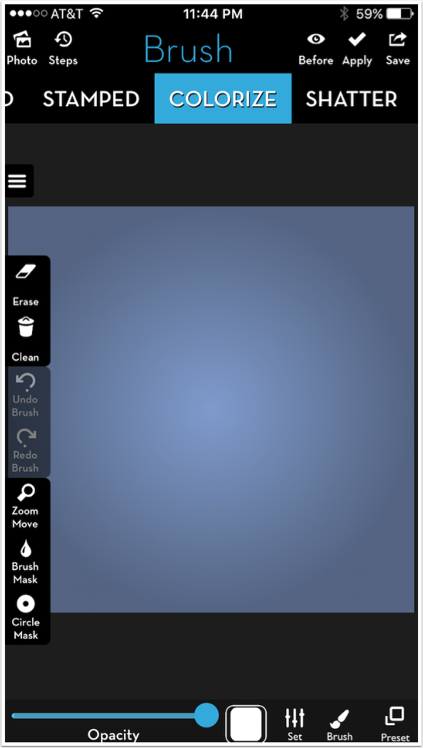
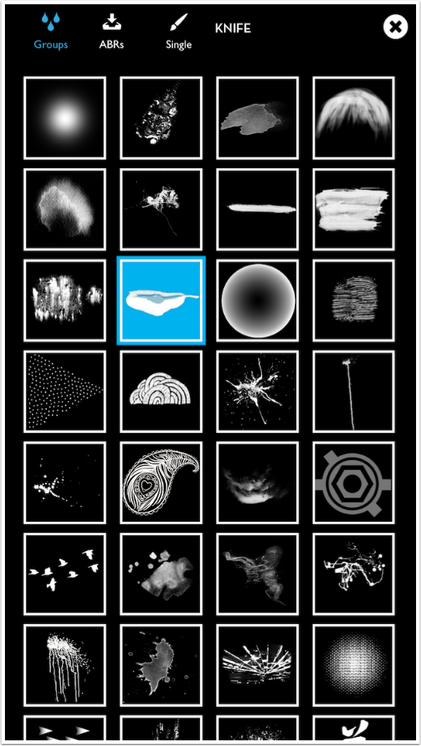
If I tap Brush, I am shown a selection of Groups of brush tips.
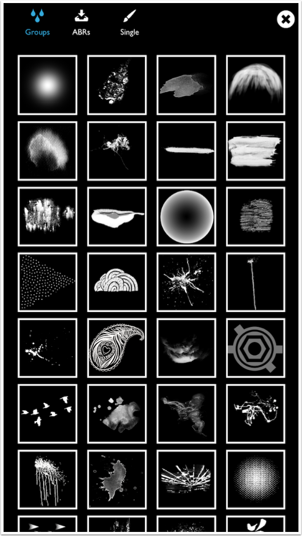
When one is chosen, the name of that brush group appears. In this case, it is Knife.
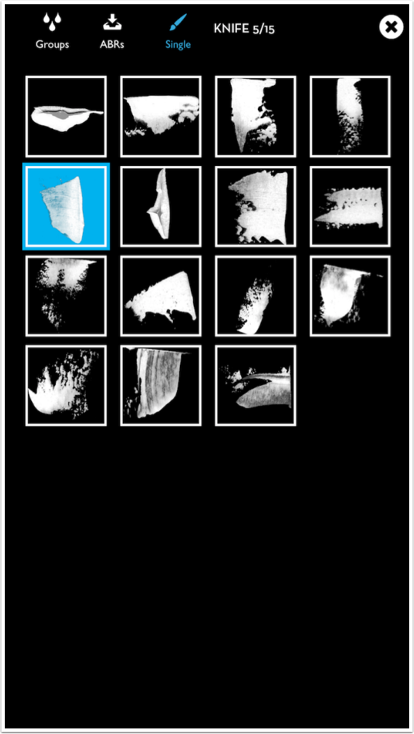
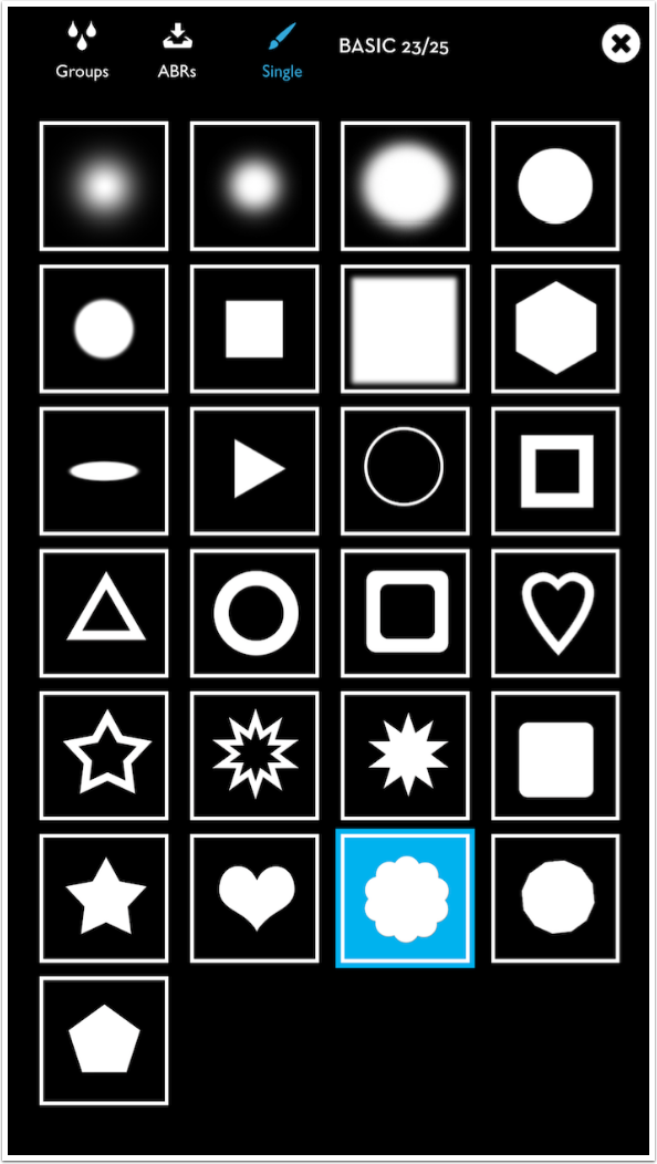
Tapping Single allows you to choose among the brush tips in the group. I select number 5 of 15.
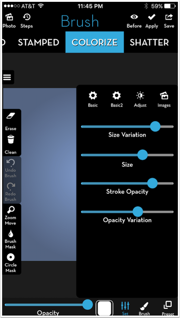
Next I adjust the Settings for that brush tip. The settings are grouped into Basic, Basic2, Adjust and Image. I make the size of the brush larger, using the slider, and also up the Size Variation, so that the brush tip will randomly get larger and smaller as I make a stroke. I lower the Stroke Opacity, so that no stroke will be at full opacity, and up the Opacity Variation.
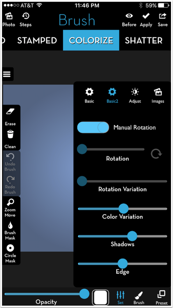
Under Basic2 I leave Manual Rotation on. This means that the brush tip will rotate to follow the direction that I make with my stroke. I up the Color Variation and the Shadow. (You’ll see how these affect the stroke in a moment.)
I tap the Color thumbnail because I want to assign a starting color for the Color Variation parameter. Color cannot vary from white; you are painting with light and white light already contains all the color there is. So if you want the color to change as you make the stroke, you have to give iColorama a starting color.
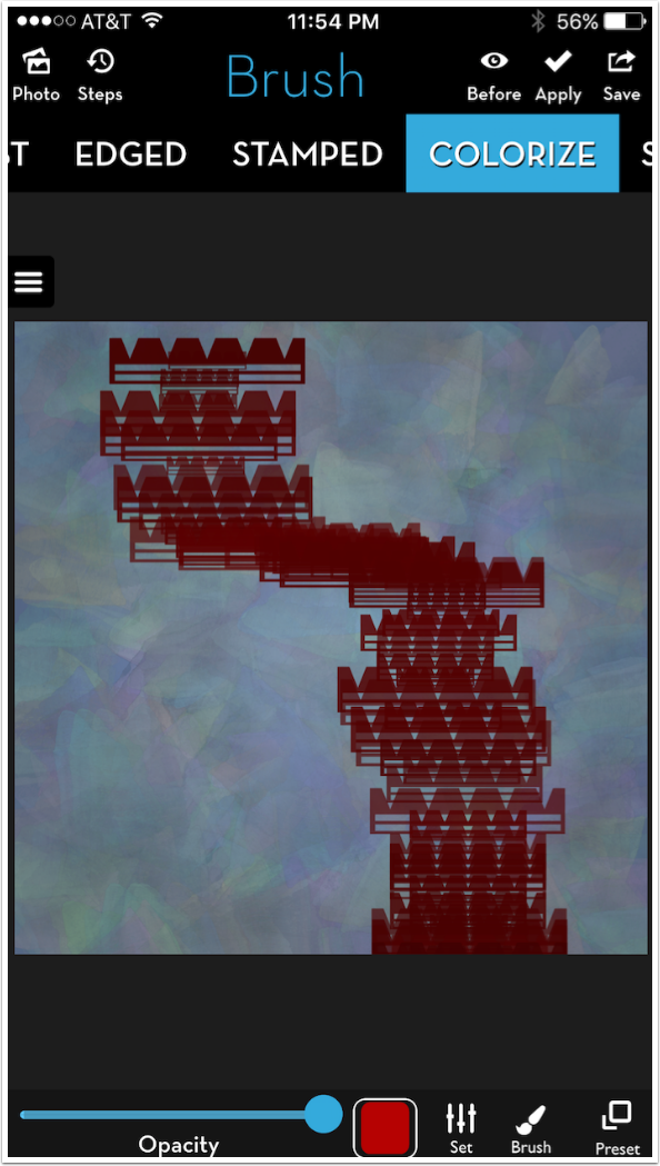
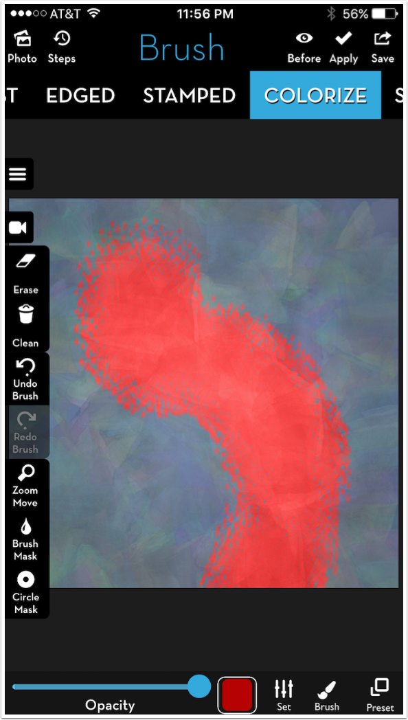
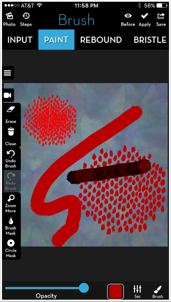
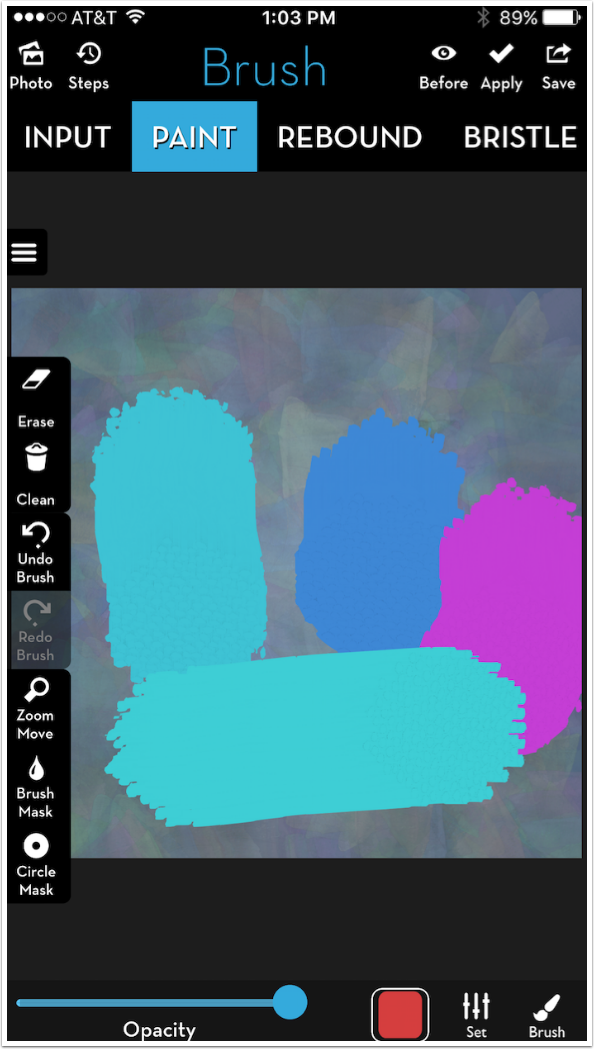
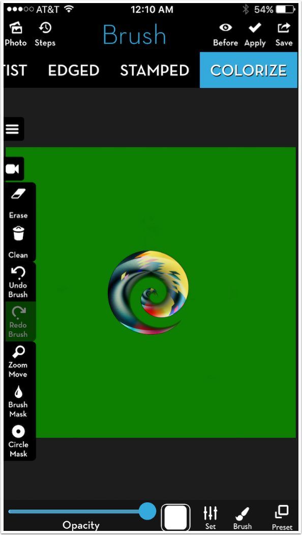
Below I’ve made a stroke with my Knife tip, using Preset 1 and the parameters I’ve set. You can pretty much tell the path I took with my stroke, starting at the top, because there’s a smeary black trail through the brush tips as they are laid down. That comes from the Shadow parameter, which puts a shadow behind the tip. Because the tip is partly transparent, you see more of that shadow gray. I decide I don’t like that, and go back to remove the shadow.
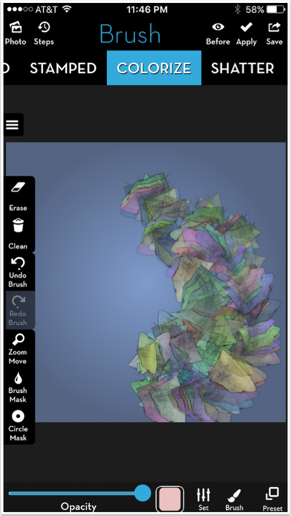
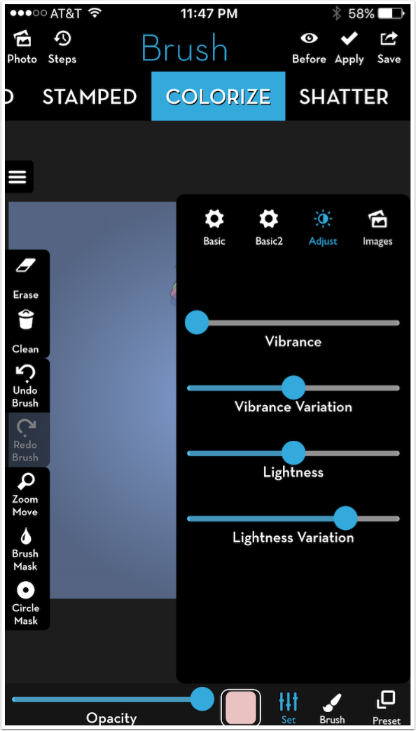
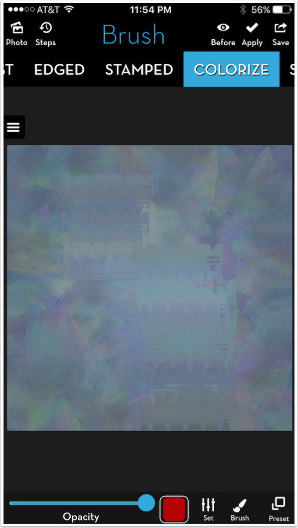
After moving the Shadow slider to 0, I visit the Adjust parameters and increase the Lightness and Lightness Variation. The stroke was too dark for me. (Not too opaque, too dark – there’s a difference.)
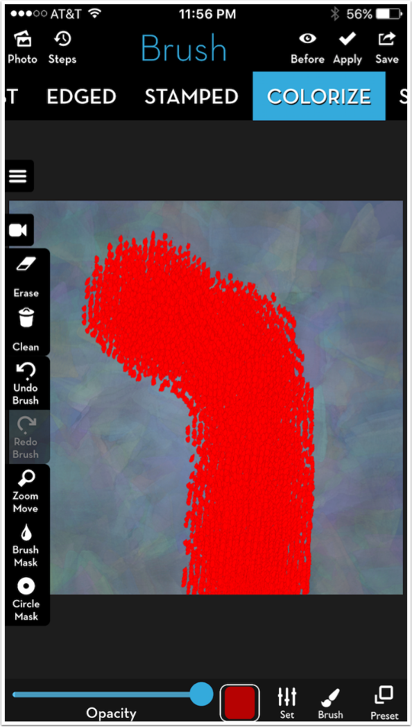
When I paint on top of the previous stroke, the brush tip marks blend with each other more because I removed the Shadow. You can still see some of the first stroke below the new one because the Opacity of the stroke is less than 100%.
I go ahead and cover the entire canvas with this brush. (A brush is really the combination of the tip and all the parameters.)
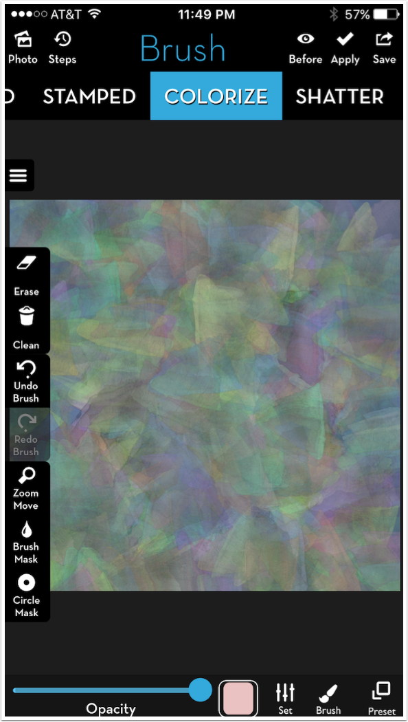
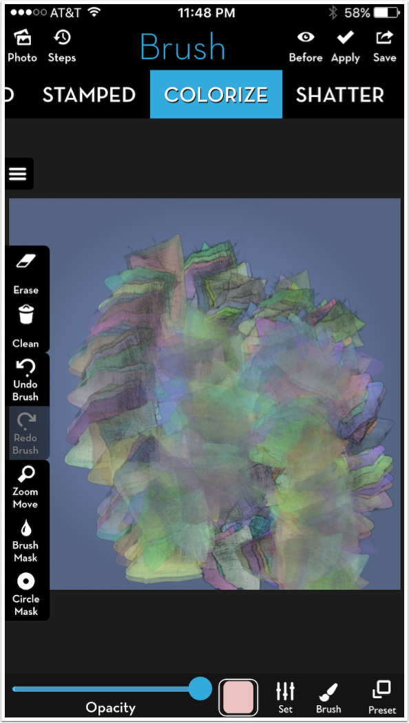
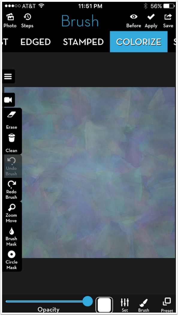
Remember when you’re painting to take the entire canvas into account. Parts of the canvas can be obscured by tools or settings. In the screenshot below, I tapped the “three line” button on the left side to hide the brush and masking tools on the left. I touched up a couple of missed areas on the left.
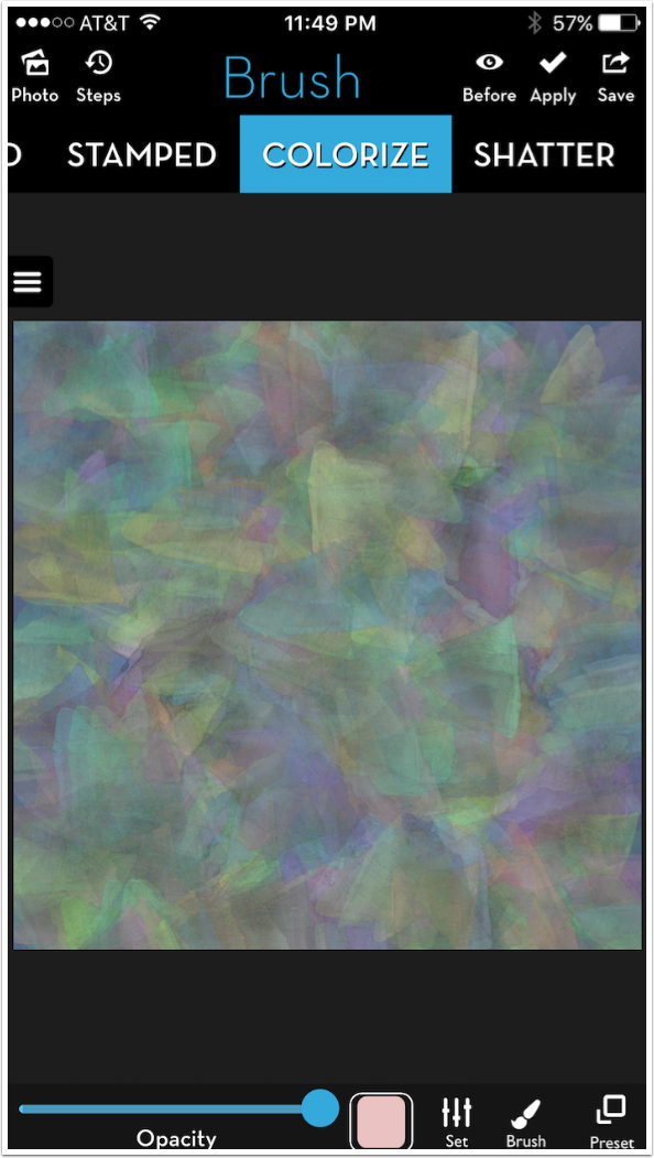
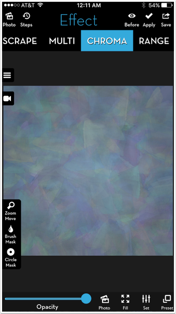
This makes a rather nice canvas. After lowering the overall Opacity of the brush strokes with the Opacity slider at the bottom (not the Stroke Opacity in the settings), I Apply the changes and use it for the remainder of this tutorial.
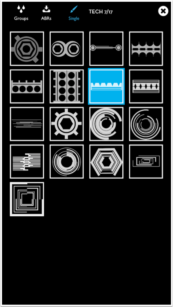
I’ve covered Colorize presets in another tutorial, but let’s go through a few here. First, I’m changing the brush tip to a Tech tip.
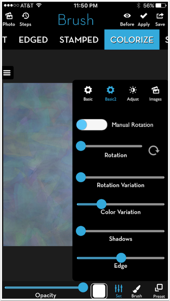
I want you to see what difference it makes when you turn Manual Rotation off. I’ve done that below. I leave Color Variation up, but it shouldn’t make any difference because I’ve reassigned the Color Thumbnail to white.
Below I’ve used the second preset, identified as “One Color” on the iPad, but just assigned #2 on the iPhone. The Tech tip remains a horizontal line, no matter what direction I make a stroke.
That’s interesting; the color changes slightly even though Color Variation is not in effect with the white color thumbnail. That’s because the second preset uses the underlying color if none is assigned with the thumbnail. The color variations in the canvas are reflected in the stroke.
There are three options for clearing previous brush strokes. Undo will remove the most recent stroke, but only the most recent. Earlier strokes are not saved and cannot be undone. Clean removes all your strokes. Erase allows you to use the current brush to erase the strokes you’ve made, but you have to be careful – partially transparent brush tips, edges and shadows can all affect this erase, giving you results you may not like.
Preset 3, also known as Grafik, gives you blocks of color.
You can get a more subtle effect with Preset 4, known as Glass Edge
There are two presets available on the iPhone that are not on the iPad. They aren’t named, so it’s harder to tell what they do. Preset 5, it seems, adds color in Color blend mode. The Luminosity and Texture of the canvas shows through, but the color comes from the brush, as shown below.
The final preset for Colorize, number 6, gives a fairly strong edge to the color that is painted on the canvas. The result resembles a Bristle brush type.
Below you’ll see the difference when I switch to the Paint brush type, using the same tip. Paint ignores partial transparency, and works more like a fully loaded paintbrush. The edge can be seen on the Colorize brush in the upper left, but not on the Paint at the lower right.
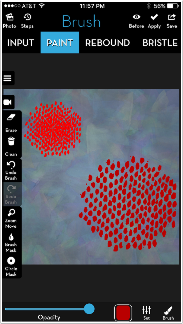
When a stroke is made rather than a dab, all the paint runs together to make a solid stroke.
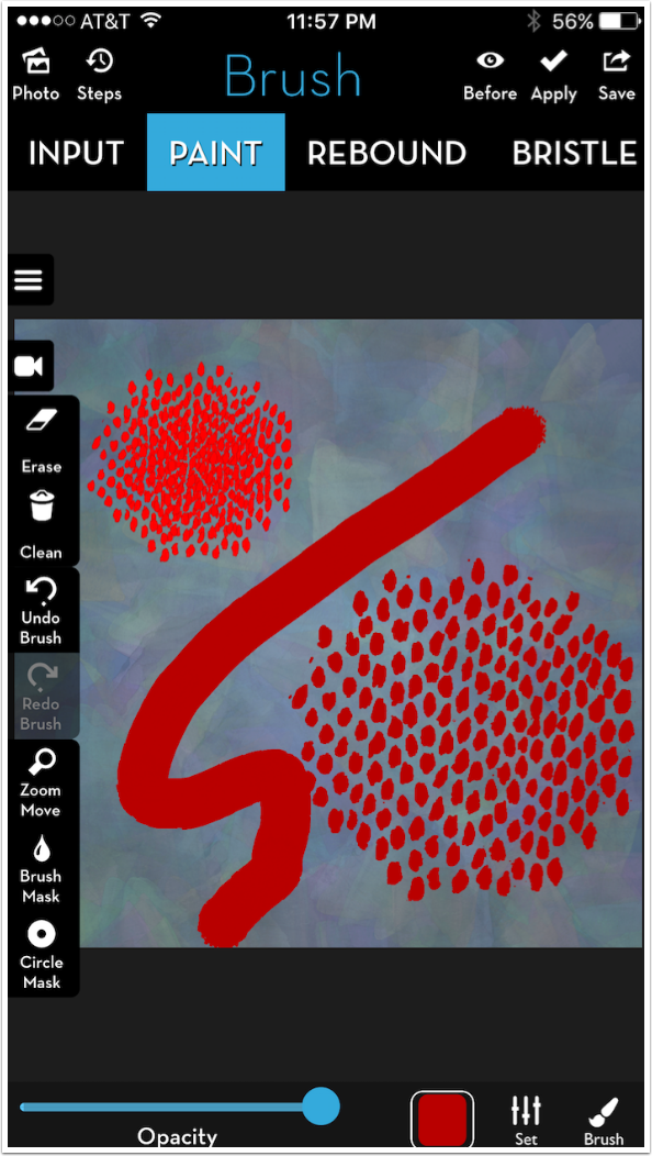
If I add Edge or Shadow to my paint stroke, that Edge or Shadow is stronger also, and the stroke becomes more black from the edge than red from the assigned color.
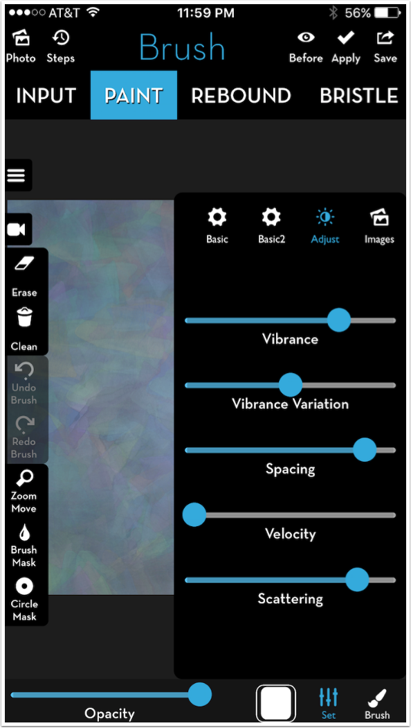
There are additional parameters for Paint under the Adjust group: Spacing, Velocity and Scattering. These are subtle effects. Below I’ve raised both Spacing and Scattering to near their maximum values.
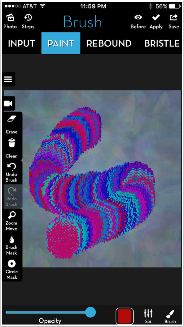
I raised the Color variation and made a stroke below.
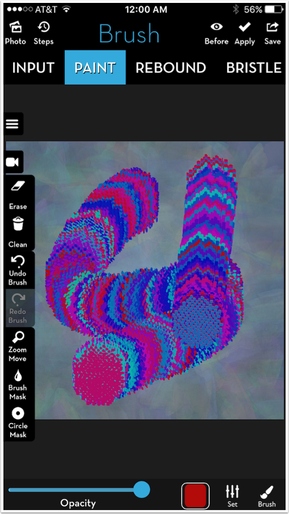
I lowered Spacing and Scattering to zero and made another stroke. There is not an enormous difference.
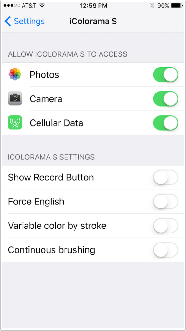
Paint gives you the opportunity to change how color variation works, while Colorize does not. By default the color of each brush tip mark is changed while you make a stroke, as seen above. But if you go to the Settings app and turn on the “Variable Color by stroke” switch, then the color will only vary once you raise your stylus and lower it again to make another stroke.
Below you’ll see the results of Variable color by stroke, using the same brush I used above.
The developer of iColorama, Teresa Alonso Garit, is constantly looking to improve the app. Recently she promised that brush tip creation was on the way. In a way, though, it’s already here, and can be accomplished with the use of the Photo button, found under the images group of Settings. (On the iPad version Photo is a button on the bottom of the screen.)
I still have to select a brush tip to get a shape for my photo brush. Below I’m selecting Basic brush 23, with its scalloped edges.
My photo is a selfie modified with Threshold, and it is used when I dab on the canvas.
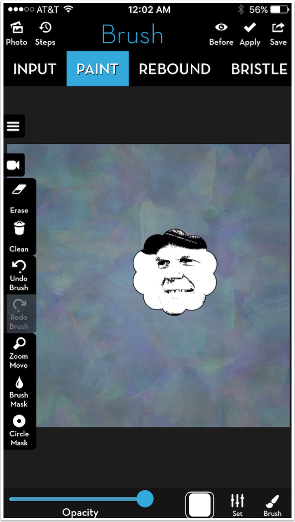
The photo changes size as the brush changes size. This makes it virtually a new brush tip.
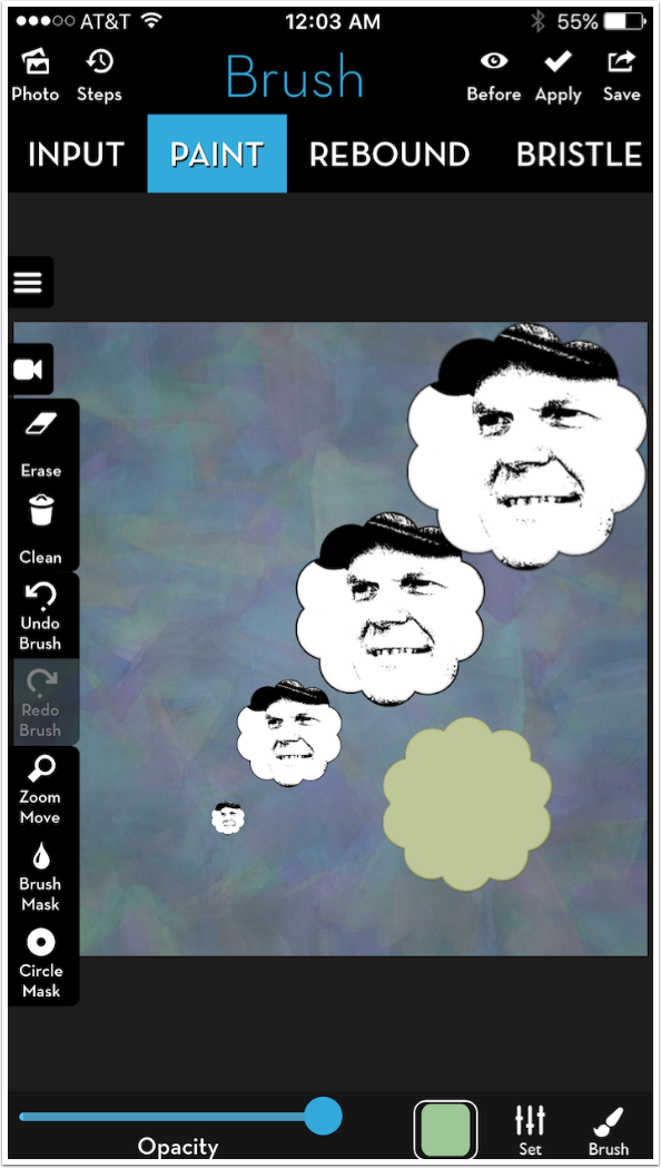
You can also change the color of the photo using the thumbnail. However, it does matter what order you assign color and photo. If you assign photo first, then color, then you will get a solid color as shown below.
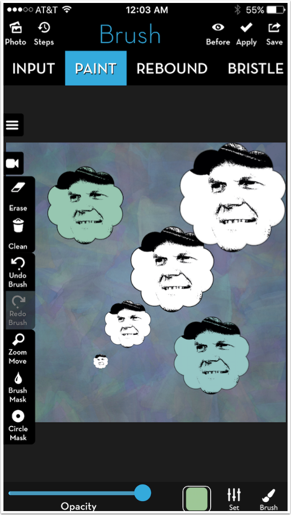
Reverse the order and assign color before photo, and you can get a proper coloured photo brush.
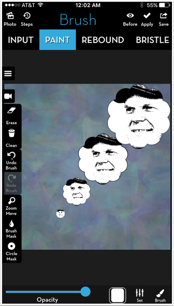
Below you’ll see a work I created with this brush. It can be a lot of fun.
Remember, Paint brushes ignore partially transparent brush tips. So when a photo is assigned to those brush tips, the photo will be fully opaque to the edge of the shape. The Spiral brush tip below (Gradient 6)., is opaque all the way to the edge. (By the way, the black edge is from the Edge parameter. The dab made at bottom center had the Edge turned down to 0.)
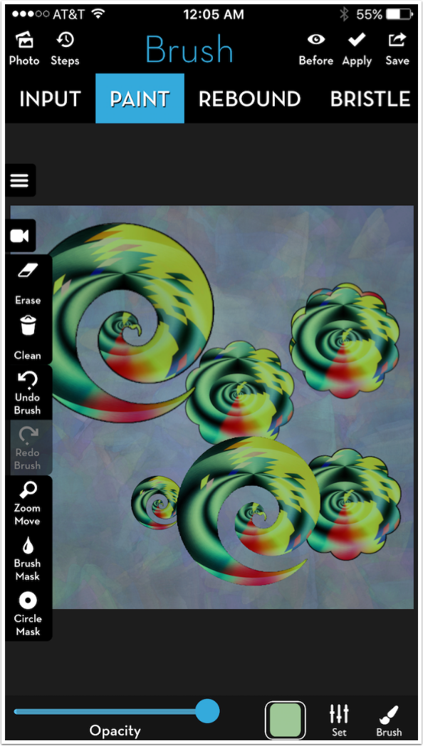
Interesting results can be had from making a stroke rather than a dab. The photo turns with the brush if Manual Rotation is on.
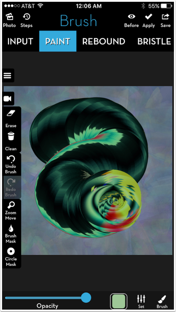
Colorize respects partially transparent brush tips. The same brush tip, with the same photo, gives a different result when transparency is taken into effect.
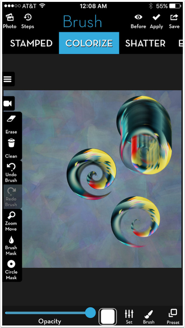
Those spirals shown above are as large as they get. Even when I shrink the canvas down, as shown below, the dab does not fill any more of the canvas. That is because the size of the brush tips in Colorize is relative to the canvas, not the screen. What do I do if I want the dab to be larger?
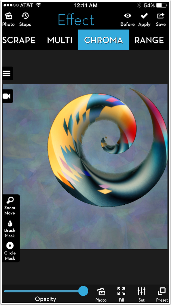
I would use Chroma, which works like a television green screen (as long as I didn’t have any green in the photo brush dab, as in this instance). I start by using Preset>Gradient and filling the entire canvas with a saturated medium green.
Then I make my brush tip as large as possible and dab in the middle of the canvas. I save the result.
I go back in Steps to my blank canvas and go to Effects>Chroma. Preset 1 is green, and Preset 2 is blue (the color that is dropped out).
Using the Photo button, I bring in the dab-on-green. I can resize it as large as I want, and rotate it if I like.
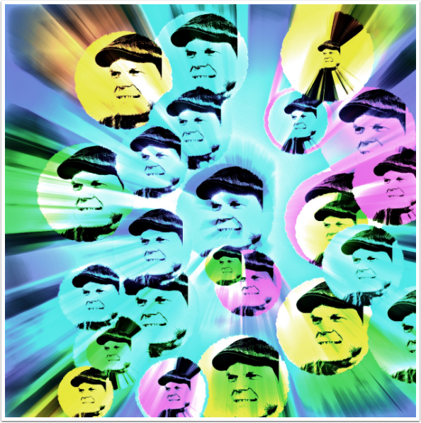
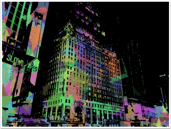
So, the question that started this series of looks into iColorama brushes was “how do I use them (the brush types and parameters)?” The answer is, “any way you want to!” They are only limited by your creativity. I used Colorize brushes here to create an abstract canvas. I used Paint to put multiple images of myself all over that canvas. And in the image below, I used Colorize Preset 5 with color variation increased to color a Threshold version of an urban landscape in a graphic manner.
Come back again and I’ll give you more tips on the operation and use of iColorama brushes. Until next time, enjoy!
Donating = Loving = TheAppWhisperer.com
TheAppWhisperer has always had a dual mission: to promote the most talented mobile artists of the day and to support ambitious, inquisitive viewers the world over. As the years passTheAppWhisperer has gained readers and viewers and found new venues for that exchange.
All this work thrives with the support of our community.
Please consider making a donation to TheAppWhisperer as this New Year commences because your support helps protect our independence and it means we can keep delivering the promotion of mobile artists that’s open for everyone around the world. Every contribution, however big or small, is so valuable for our future.
Jerry Jobe
Never content with just scratching the surface of what an app can do, Jerry Jobe decided to pass on what he learned about imaging apps to others. He’s constantly trying to figure out just what tools other artists have used, and trying to incorporate them into his own work, in an attempt to find his style. He’s written tutorials on over 145 apps so far, which you can find (along with his Song of the Day entries) at http://enthusiasmnoted.wordpress.com/ He lives near Atlanta, Georgia, where he also finds a creative outlet in acting and directing in community theater.