Mobile Photography – StreetWise – Third Challenge Results – Minimalism
Welcome to our Third StreetWise Challenge Showcase – ‘Minimalism’. We are thrilled to share it with you!
“Anyone can make the simple complicated; creativity makes the complicated simple” Charles Mingus.
We were thrilled by your photographs submitted for our StreetWise Minimalism Challenge. This theme was indeed challenging, and Lee and I were so happy to see the wonderful displays of ‘creativity’ utilised by our group to come up with an eclectic array of images.
Thank you so much for participating and rising to the occasion to inspire us once again with your photographs. We hope you enjoy the showcase as much as we enjoyed putting it together!
Many congratulations to the following artists for being featured in this showcase including:
Elaine Taylor, Connie Gardiner Rosenthal, Julia Nathanson, Paul Yan, Liliana Schwitter, Dominique Torrent, Armineh Hovanesian, Sally Ann Field, Stephanie L.P., rorofot, Kate Zari Roberts, Christine Mignon, Rene Valencia, RK, Susan Rennie, Roger Guetta, Ocean Morisset, Ger ven den Elzen, Giulia Baita. Ile Monte, Nick Kenrick, be-mo-re [hopes].
‘Charlie, British Museum’ – Elaine Taylor
Elaine Taylor’s image is a nice example of minimalism photography in which less is definitely more.
It is both a simple and beautiful photograph with a large swath of empty frame and a single person walking through it. The most important element is the boy as he makes his way, technology in hand. What’s interesting about Elaine’s photo are the subtle shapes of architectural design and construction upon the wall and in particular the geometric shadows in the negative space. Both immediately place the figure in a larger context. They give the sense of how humans occupy space, as well as create it. In fact, the background in relation to the boy gives the viewer a good idea of architecture on a large scale while not being distracting or competing for attention with the main subject.
Well done Elaine! Great shot!

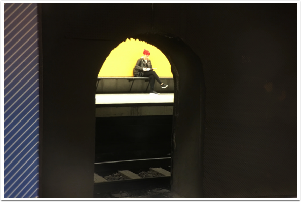
‘Metro in Barcelona’ – Connie Gardiner Rosenthal
Connie’s ‘Metro in Barcelona’ depicts a busy public space, and yet she has found a perfect niche in which she is able to boil down that busyness to simple lines that do not distract from the main subject, a girl waiting for the train.
Connie creates a very nice, as well as, interesting balance between detail and negative space. The viewer quickly takes in the small glimpse of track, the clean lines of the bench, the yellow wall, and an architectural opening through which Connie’s keen eye has found her subject. Yet, none of these details are competing with the subject. They simply give context and scale to the girl, who is all in black. Our eyes instead are drawn to her vibrant red hair giving her prominence against this simple yet referenced composition.
Wonderful image, Connie!
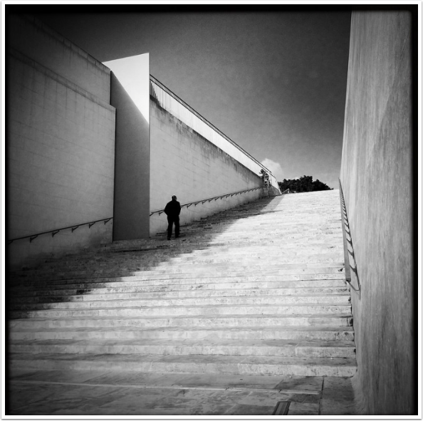
‘Untitled’ – Christine Mignon
Christine’s image is a beautifully toned black and white photo where the dramatic architecture provides the backdrop for the subject ascending the almost seemingly oversized proportion of the stairs. There is not a lot of contrast to the main shadow that borders the stairs, but the dark trees and the small puff of white cloud at the top of the stairs help to punctuate the radial composition in it’s center, leading the viewer’s sight to follow the dark toned subject up the stairs with him.
Well done, Christine!
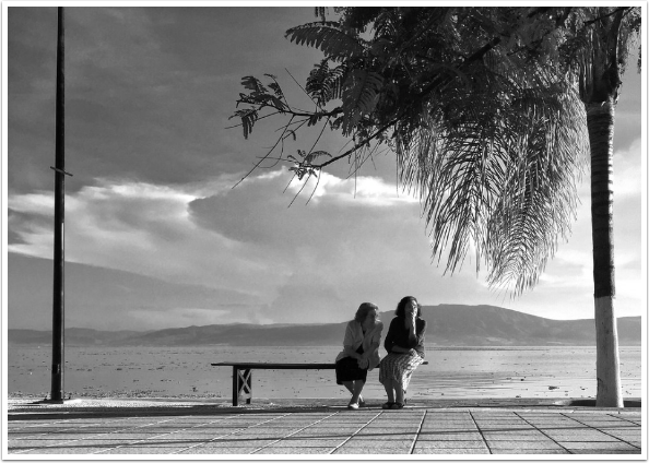
‘My Old Friend’ – Rene Valencia
Rene’s photo is wonderfully composed in that it is very balanced by the tree to the right and the pole to the left. The lines on the sidewalk also help to draw us to the subjects initially. It is from there we begin to notice some interesting details.
The light on the woman’s arm on the right accentuate it against her dark shirt, which mirrors the shape and tones of the palm tree’s trunk.
There is almost an illusion that the bench on the right side is missing legs and that the women are mysteriously floating.
When one looks closer at the background behind them, you begin to notice that there is quite a dramatic sky going on, and yet ironically, the women are facing away from the ocean view, and seem to be quite involved in a conversation – as one would be with ‘an old friend.’
Fabulous, Rene!
StreetWise Minimalism Showcase
Donating = Loving = TheAppWhisperer.com
Bringing you (ad-free) TheAppWhisperer.com takes hundreds of hours each month and hundreds of pounds to sustain. If you find any joy and stimulation here, please consider becoming a Supporting Member with a recurring monthly donation of your choosing, or possibly making a one-time donation. This is a not for profit website and one that can only grow with your support.
[seamless-donations]

One Comment
Elaine Taylor
Thank you so much for including my image here. I absolutely love the words you used to describe my photo.
Its such a great showcase to be part of.