Mobile Photography / Art Tutorial – Snapseed and Assembly Apps Want To Have a Word With You
We are delighted to publish Jerry Jobe’s latest mobile photography/art tutorial for our viewing pleasure. This time Jobe takes a look both Snapseed and Assembly apps, specifically at their textual input functionalities. Take it away Jerry…(foreword by Joanne Carter).
Both Snapseed and Assembly and can be downloaded below:
“Two apps that I’ve covered a number of times, Snapseed and Assembly, have separately come up with text additions in the past couple of weeks. Neither one has all the capabilities of a full-featured text app like Phonto or Over, but each has capabilities that are not found in text apps.
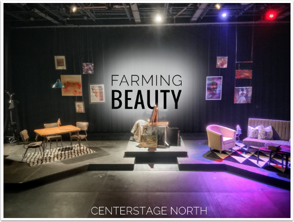
My first image is one I created in Snapseed, from an image of the set for my latest acting gig. The image was captured in vividHDR, then toned in Snapseed before adding the text. Can you guess what feature Snapseed adds that regular text apps don’t have?”
The screenshots for Snapseed come from the iPhone; those for Assembly from the iPad. You can see below that there is a new module in Snapseed under Tools called Text.
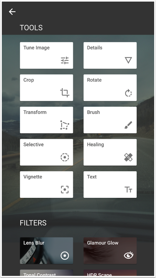
The workspace is laid out as you would expect. There are three buttons along the bottom: Color, Transparency and Style. Above that are the options for the button you’ve chosen; in this case, Style. In the center is the default text, in the last Style chosen from a previous session.

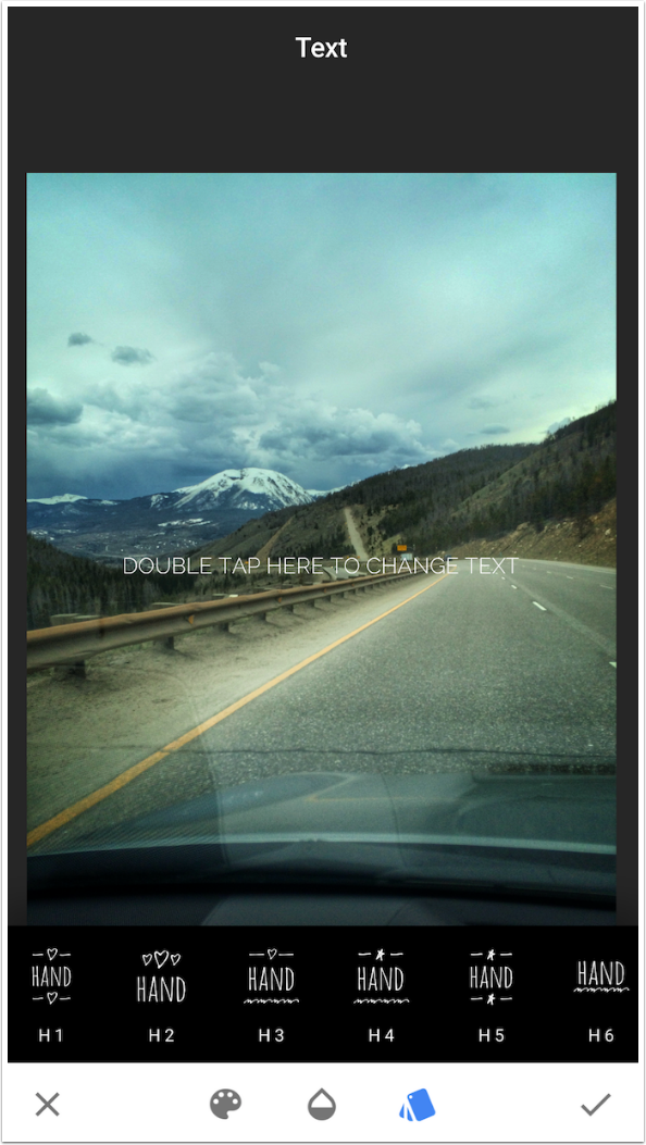
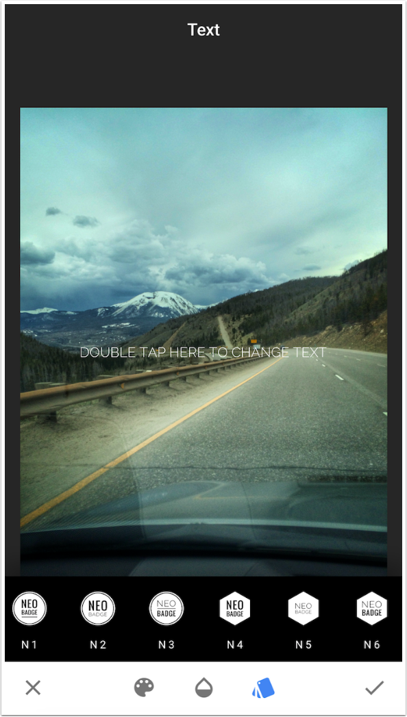
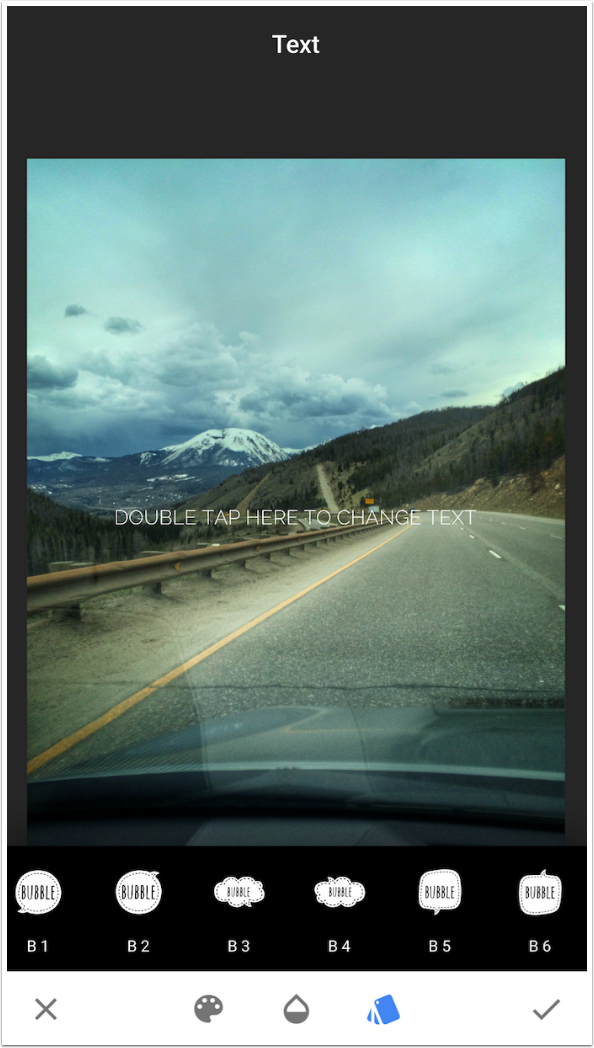
The Styles are broken into five different types: Line, Hand, Neo, Manhattan and Bubble. Other than Bubble, which has six presets, each type has eight presets.
The Line presets place all the text on a single line. The other presets will break the text into lines automatically. You cannot change the line breaks or the fonts used in a style.
Below you’ll see the Hand presets.
Neo Badge presets put the text onto a coloured shape.
Manhattan styles use bold fonts. Some of them may have backgrounds.
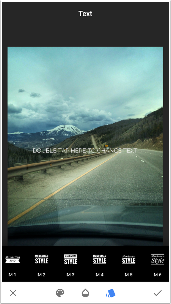
Bubbles place the text in a handwritten font on top of speech bubble graphics. The proportions of the bubbles can’t be changed.
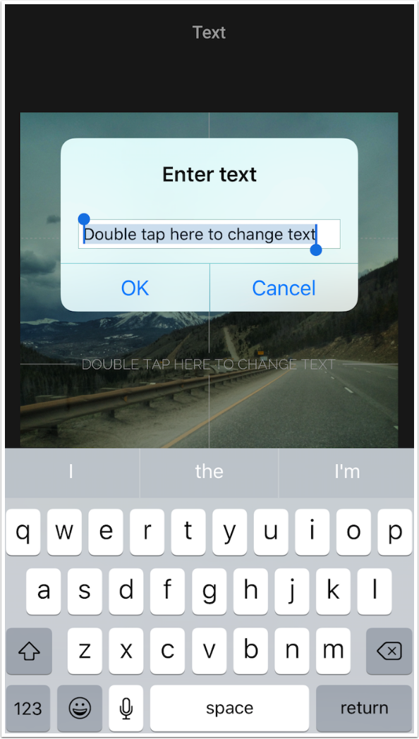
When you double-tap the text, a window appears that allows you to type the text in a single line. Remember, Snapseed will either not break the text into lines or break them automatically.
Since we’ve got a highway shot, I’ve added the text “taking the open road”.
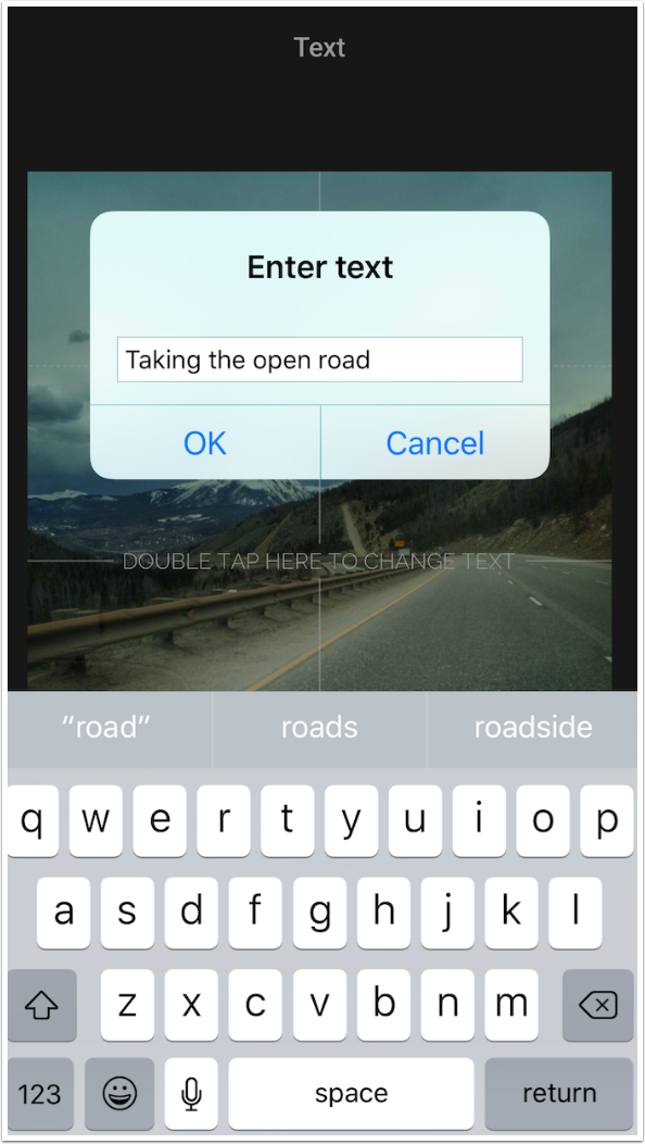
If you look at the image below, you’ll see that there are guide lines that help you center your text. If you drag the text around with a finger, you’ll find that the text does not snap into place on those lines. They are merely a visual guide.
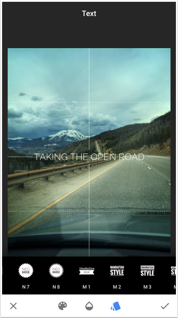
I chose Manhattan style 2 below. The text can be dragged with a single finger, and resized with a two-fingered pinch. Text in Snapseed can’t be rotated.
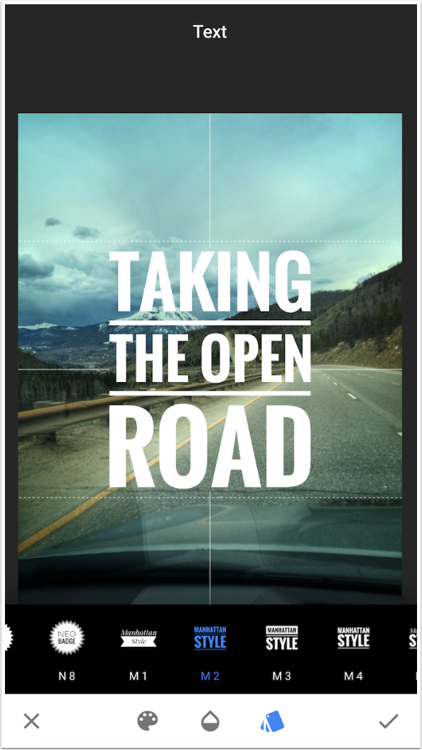
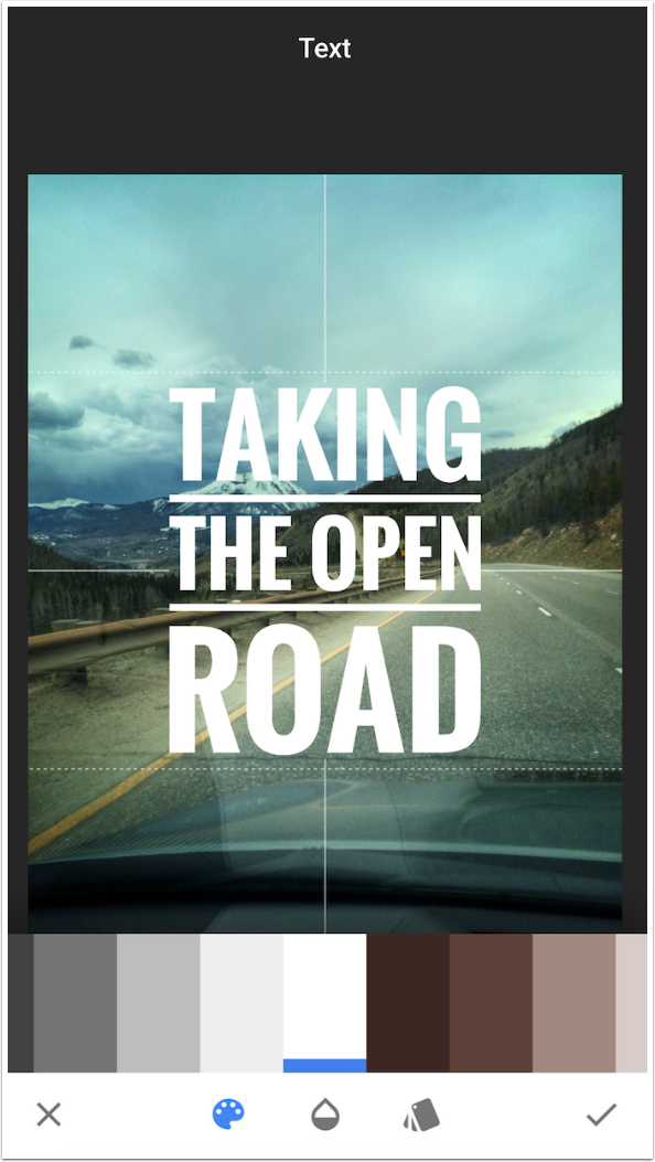
The Color palette allows you to choose among 47 specified colors. You can’t create your own color or pick one up from the image.
The Transparency option gives you an Opacity slider and an Invert toggle.
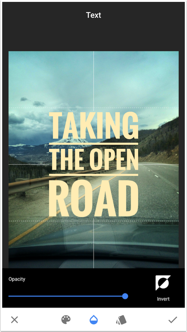
Invert swaps the opaque portion, allowing the background to become opaque and the text to become transparent.
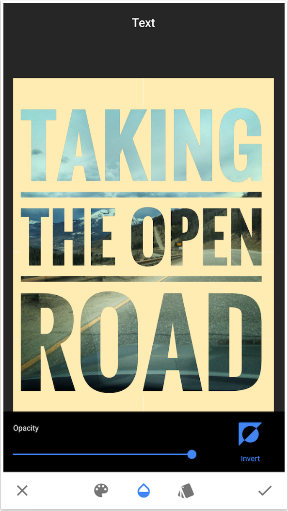
I could decrease the size and drag the text to the lower tight corner as shown below, but let’s continue and show you the ability that Snapseed has that most text apps don’t.
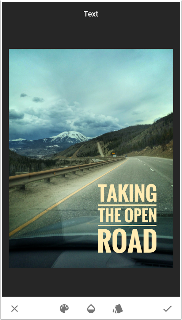
The version of Snapseed which appeared last year allows for masking of any of the effects in the Stack. The Stack is accessed after accepting the Text changes with the check mark. Then, on the main screen, you tap the number in the upper right corner to access the Stack.
Below you’ll see that I’ve tapped Text, the uppermost level in the Stack. A flyout appears, allowing you to delete the level, mask the level, or re-edit the settings in the level.
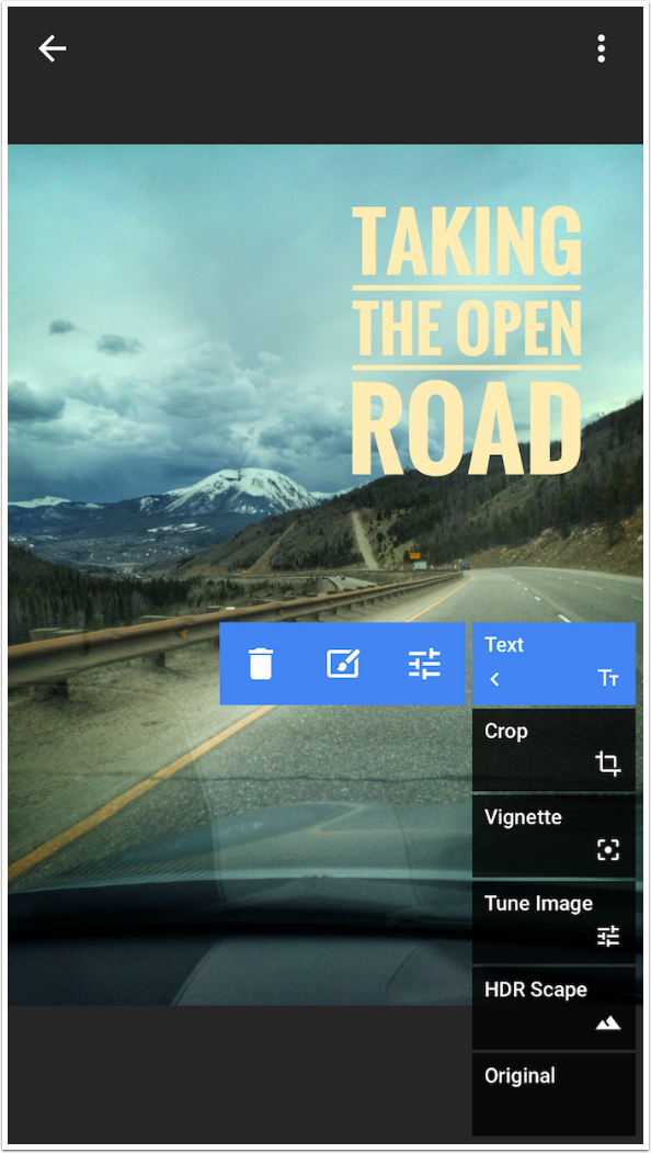
Using the Masking feature (described in last year’s series on Snapseed), I’m able to mask out the text and make it appear as though it’s behind the ridge and clouds.
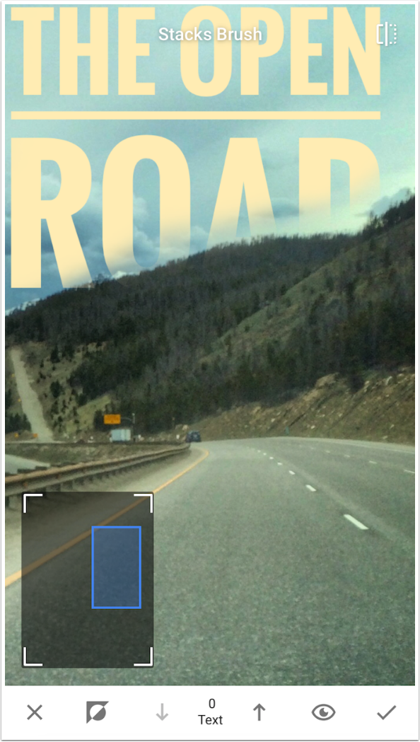
And here’s my finished image.
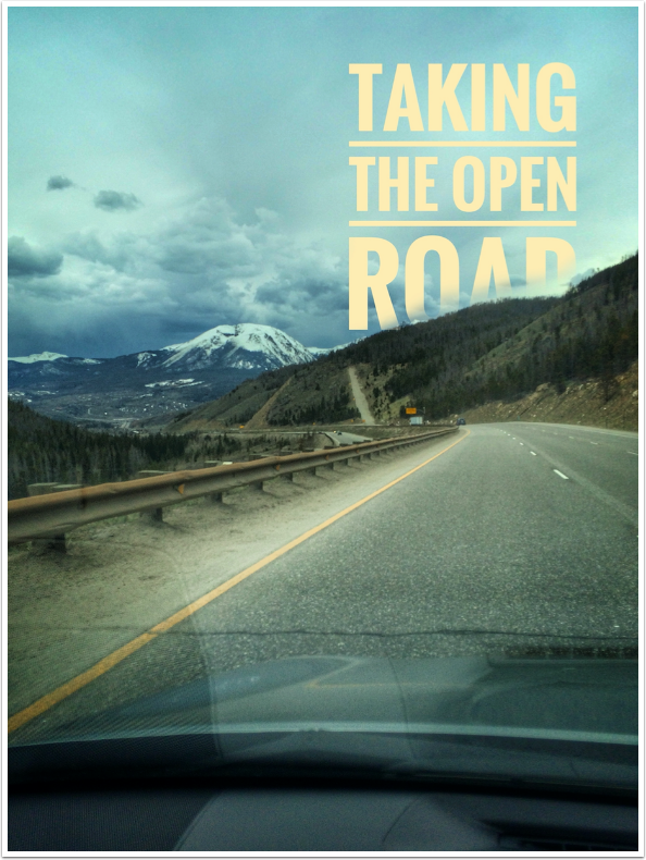
Remember, you can’t control line breaks in Snapseed, and you can’t change the fonts within a style. You also can’t rotate the text. But you can mask the effect, which adds capabilities that most text apps don’t have.
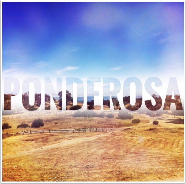
I’ll finish Snapseed with two treatments of the same image, a park in California. This scene reminded me of the Bonanza TV series, so I added the name of the ranch in that series, Ponderosa. The Neo badge was changed to a gold color and the opacity was lowered. Then I masked out the portion below the horizon.

By inverting the text and then masking in only part of the background, I created the effect below. This is the same effect that was used on my opening image.
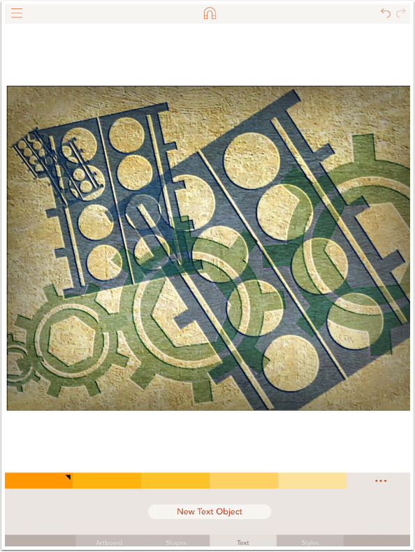
Let’s move to Assembly, the vector shapes app. There were three options at the bottom: Artboard, Shapes and Styles. Text has been added. I changed the Artboard from white to an image I created using a not-yet-available app from the creator of iColorama called Metabrush.
Once you select the Text option, you have to press a button to add a “New Text Object”.
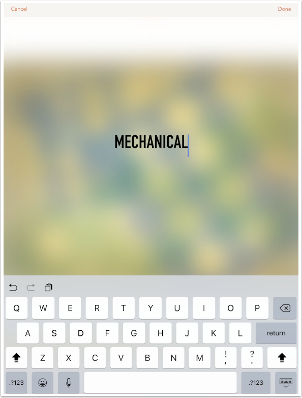
The workspace blurs out, and you can add the words you like. The Return key is active, allowing you to make line breaks where you wish.
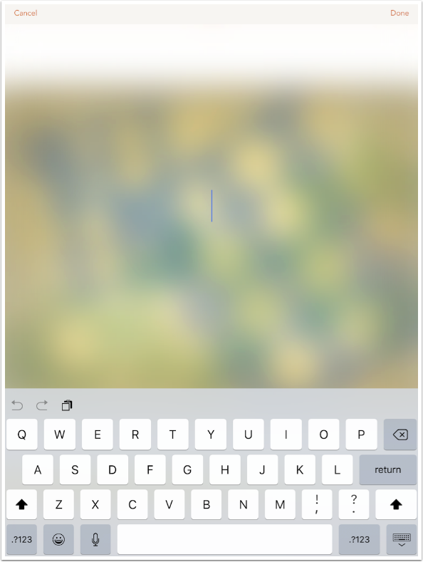
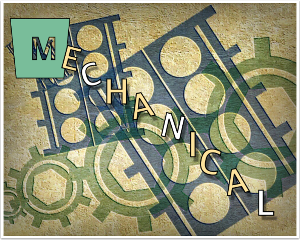
I add the word “Mechanical”, which goes along with the background. I then tap “Done” at the top right.
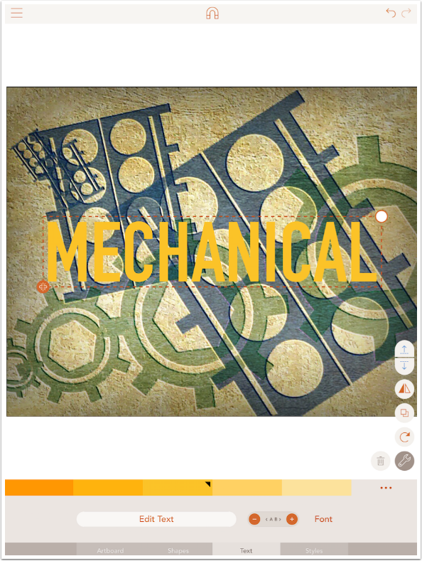
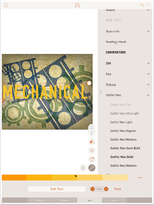
There are now new controls at the bottom. Colors are selected through the use of palettes, just as they are with the Shapes (discussed in my Assembly tutorials). There’s a button to Edit the text, a – and + to change the distance between the letters, and a Font button. If there was more than one line of text, there would be addition controls for justification of paragraphs (left, center and right) and for the distance between lines.
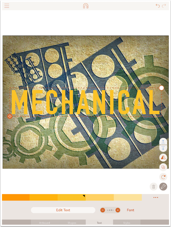
Below I used the + button to increase the distance between the letters.
There are not a large number of fonts in Assembly – only 17. However, the number of different things you can do with the text makes the limited number of fonts an easier pill to swallow.
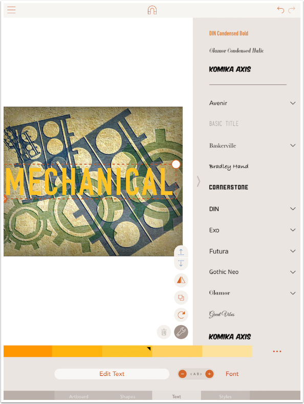
If the font has an arrow to the right, then there are variations to the font that are also available.
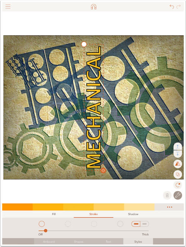
Text objects can be treated just like Shapes in Assembly. You can add a Stroke and Shadow, and you can rotate the text fully.
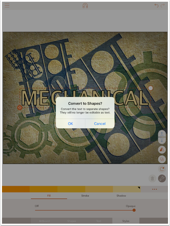
In addition, if you tap the orange “broken link” icon at the lower left of the bounding box for the text, you can convert the letters to shapes. You will no longer be able to edit the text, but you will be able to treat each letter as a separate shape, which really increases the possibilities.
By making each letter a separate shape, I’m able to change the size, position, rotation and Style of each letter.
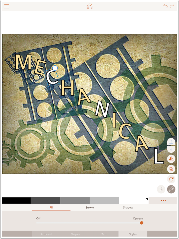
It is possible to regroup the letters and resize and move them in tandem.
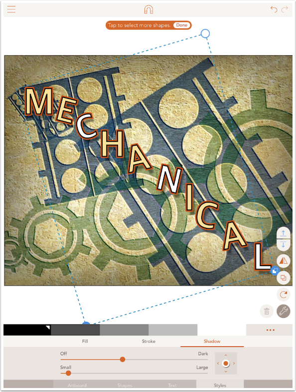
Below I did just that, decreasing the size of the group and moving it to the upper right.
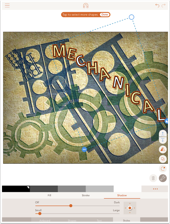
You can also group letters with a shape, as seen below.
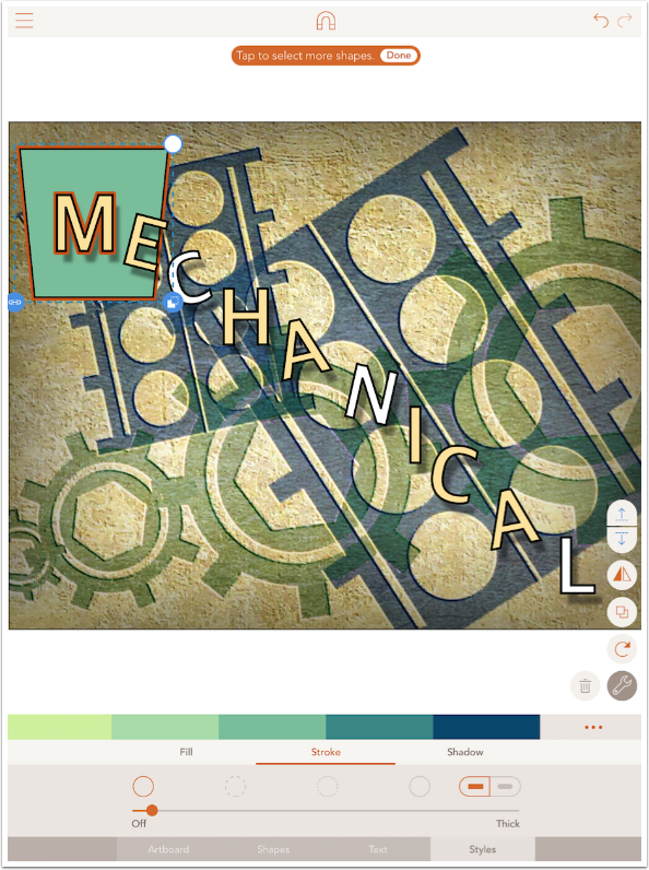
When you group a letter with a shape, then you can Combine, Cutout, or Intersect the letter with the shape by tapping the blue double box icon on the bounding box.
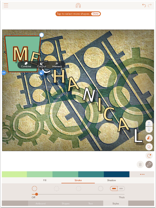
I used Cutout to cut the M out of the shape in the finished image below.
The possibilities are endless. Not only can you cut letters out of shapes, but you can cut shapes out of letters. In the image below, I created a thin rectangle, and used it to cut out part of the phrase “Flight Path”.

Because Assembly is powerful enough to use for commercial illustration, the addition of text is really a necessary change. But for amateurs like myself, it’s just a really neat addition.
While neither Snapseed nor Assembly have added enough text capability to make you forget dedicated text apps, each has functions that make text unique. Snapseed has masking and Assembly has “convert to shapes”. I hope you find creative use for both! Until next time, enjoy!

One Comment
Jelly Beans
Jerry rocks!