
Mobile Photography / Art Tutorial – MaxCurve Part One: Take it Easy on those Curves!
We are delighted to publish Jerry Jobe’s latest mobile photography/art tutorial for our reading and viewing pleasure. This time Jobe takes a look at the app called MaxCurve. This is Part 1 of 3 Tutorials that we will publish on this app. Read Jobe’s thoughts as he puts it through its paces (foreword by Joanne Carter). Take it away Jerry…
MaxCurve retails for $2.99/£2.29 and you can download it here.
“As time goes by, mobile photography apps become more and more powerful. You can do things to your images on the iPhone or iPad that were unthinkable just four or five years ago. One of the main changes is the explosion of methods to give you ultimate control over your images. Most of us are not satisfied with just the ability to add a filter to our images – we want control.
Curves as a control method has been present in desktop apps like Photoshop for years. Entire volumes have been written about their use. They have also made their way, slowly but surely, into mobile apps. iColorama recently added Curves, and they’ve been present in Leonardo, Filterstorm, Laminar, and (of course) Photoshop Touch, among others. But there’s a new app on the market that jumps the use of curves to a whole new level: MaxCurve, by Wanman, Inc. If others can write books on the use of Curves, I can at least stretch the discussion of MaxCurve into three separate tutorials. The lessons learned here in this first installment about RGB curves will help you in those other apps that implement curves, and next week’s entry will take us into uncharted territory.
The screenshots throughout this series are from the iPhone version, but MaxCurve is a universal app. The iPad screens are slightly different, but you should easily be able to translate to the iPad version”.
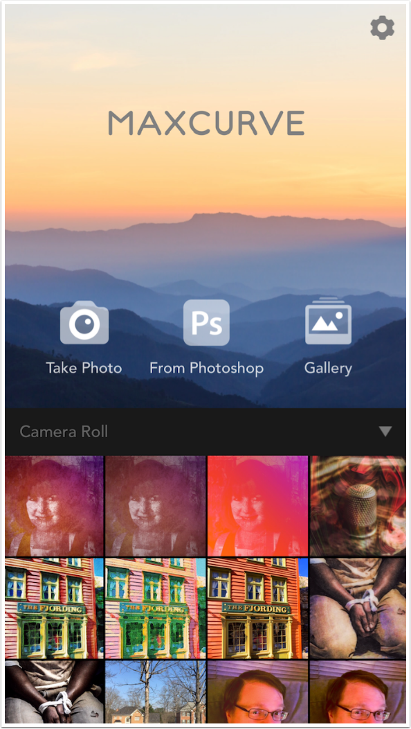
MaxCurve can capture images through your Camera; it can let you set up a wi-fi connection to your PC so that you can directly get a flattened image from Photoshop (MaxCurve does not handle Photoshop layers); and even load images from an online user Gallery. Images from the Gallery come with the MaxCurve layers that were added to create the total effect. Those layers can be saved as a preset so that, if you like an effect, you can see the curves that went into it and tweak them if you like. The image loaded from the Gallery, on the other hand, can not be edited or saved to your Camera Roll, so loading your own images to the Gallery is relatively safe.
Of course, you can also choose an image from your Camera Roll. If you wish to select an image from another folder, just tap on the bar between the header and your images.
You will be taken to a list of your folders to select an image for editing.
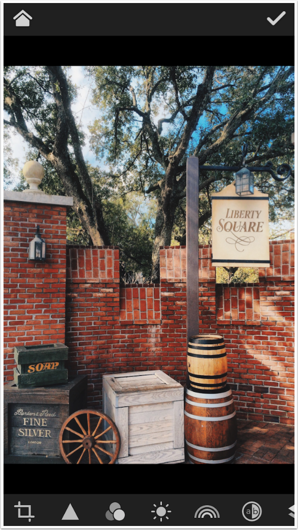
Once you’ve loaded the image, you’re taken to the main workspace. At the top are two buttons. The Home button takes you back to the image picker, and the check mark is the Save or Export function.
The first two controls at the bottom are standard editing tools. The first is Crop; the second (Triangle) contains Sharpness, Grain and Vignette controls. The third is where the Curve controls begin, with the RGB curves. The next three are only found, as far as I can tell, in MaxCurve: Lightness Curves, Hue/Saturation Curves, and the fascinating LAB curves. Following LAB curves is the control for Layers, and, if you scroll to the right, Presets.
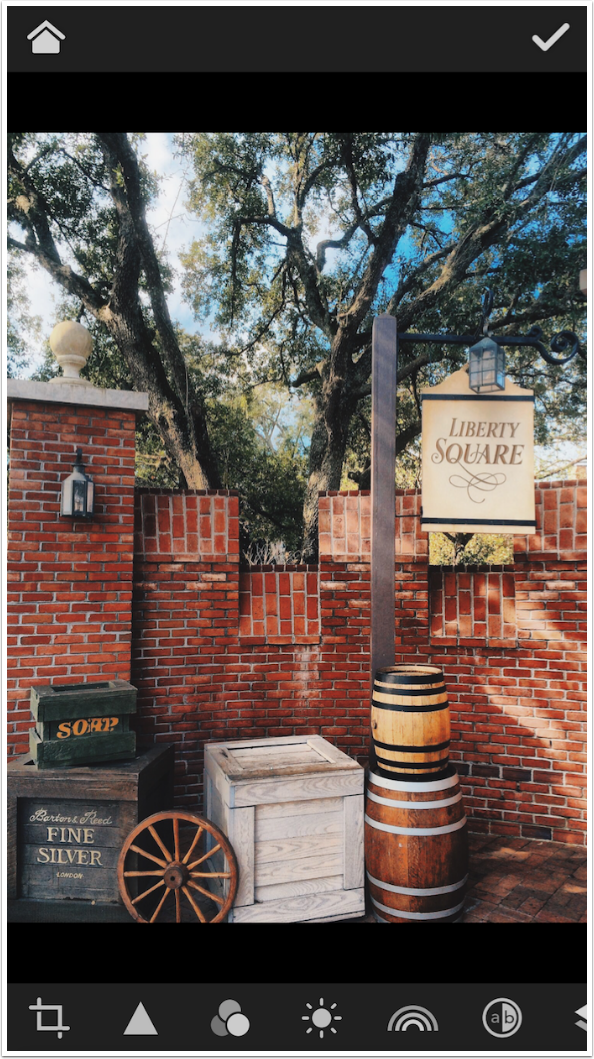
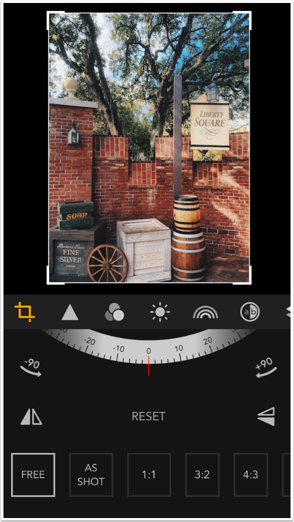
Let’s take a look at Crop first. The image shrinks to allow further controls to be shown. In addition to the crop handles around the image and the standard crop ratios at the bottom, there are controls for rotation and flipping the image. If you make a mistake, you can start over by tapping Reset in the center.
Tapping the highlighted Crop icon again will close the controls and expand your image to fill the screen. So tapping an icon shows the controls; tapping it again hides them.
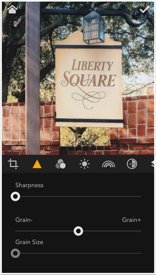
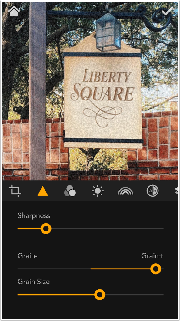
The next icon, as I said, contains Sharpness, Grain and Vignette controls. Sharpness is a single slider which starts at no added sharpness, and only moves in the direction of added sharpness. No blurring can be done.
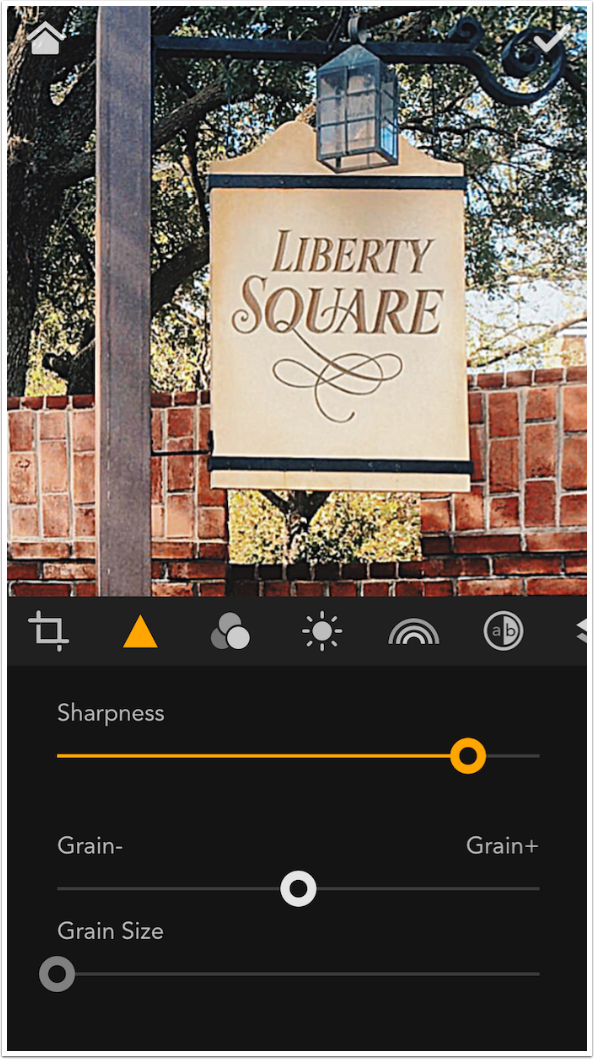
Below you’ll see Sharpness at close to maximum. Compare it to the image above with no Sharpness. The Sharpness seems to be a good algorithm, which will not make your images look ridiculous with halos at even the highest setting.
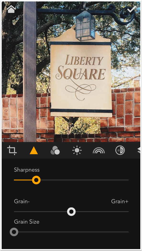
The Grain slider starts out at the middle, and the Grain Size slider is not active at this default value. The Grain slider must be moved before Grain Size becomes active. Below you can see I’ve added Grain of a fairly large size. If you’ve followed me through my other tutorials, you’ll know that I’m not a fan of Grain.
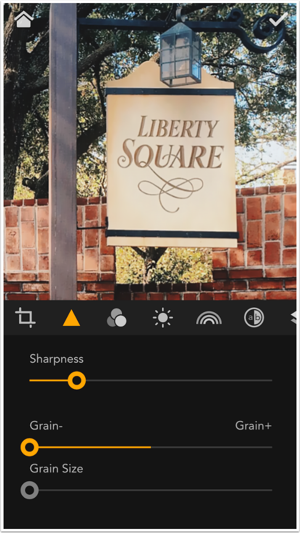
But what’s really interesting is the “hidden” feature of the Grain slider. By moving it to the left, or “-“ side, it acts as a fairly decent denoiser. Below, take note of the noise present in the gray pole.
When I move the Grain slider all the way to the left, that noise disappears. This is a pretty good undocumented feature.
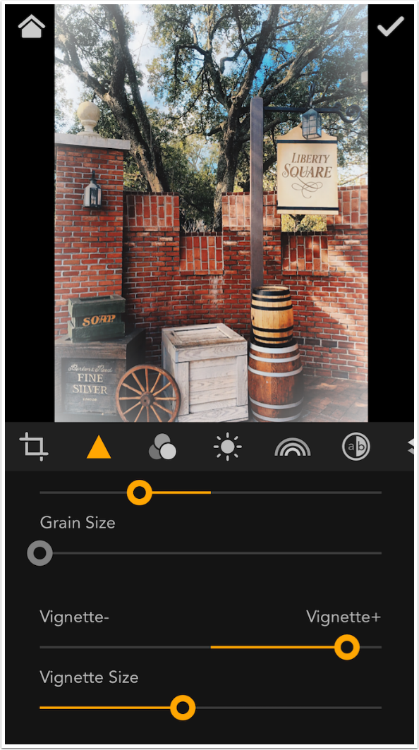
Vignette works the same as Grain. Vignette Size will not be active until you slide the Vignette slider to the positive or negative side. Positive creates a white vignette; negative creates a black one.
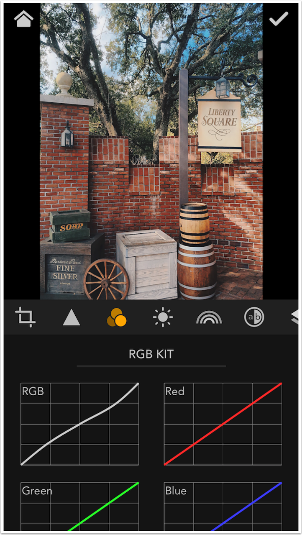
Each group of curves, accessed by tapping one of the next four icons, is called a “Kit”. The first icon accesses the RGB Kit. These are the curves you find in other apps that give you curve control. There are four curves in this Kit: RGB, which controls all colors at once, and the individual colors of Red, Green and Blue. Tapping any one of the four boxes brings up that individual curve for editing.
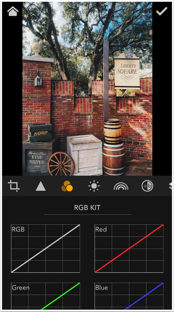
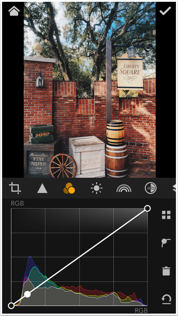
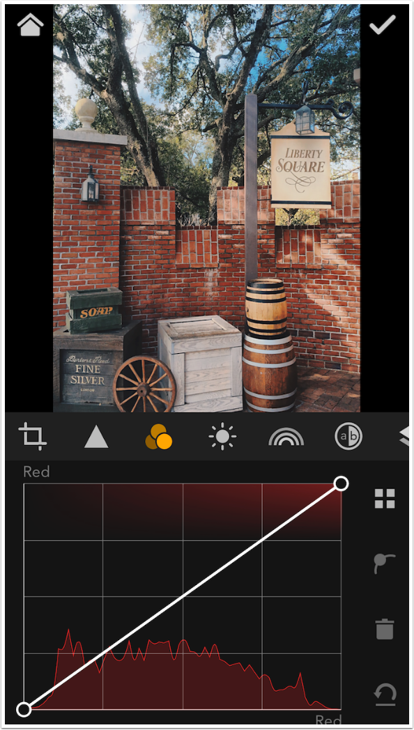
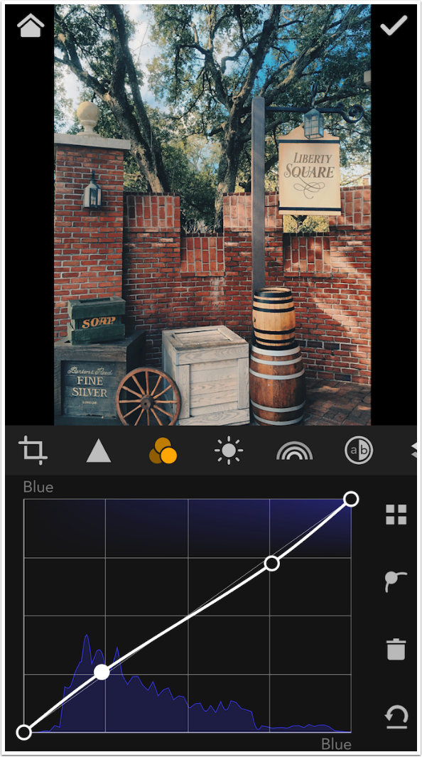
The first thing you may say when seeing the RGB curve below is “that’s not a curve, it’s a line”, which would be correct. The default curve, when no adjustments are made to it, is a line. In this case, the bottom left part of the curve (line) is the blacks in the image, and the values in the image get lighter as you move to the right, until you reach the whites at the upper right. If you look at the histogram under the curve, you will see that there aren’t any true blacks or whites in the image, but that there are more pixels that fall to the darker half of the histogram (the peaks are higher there).
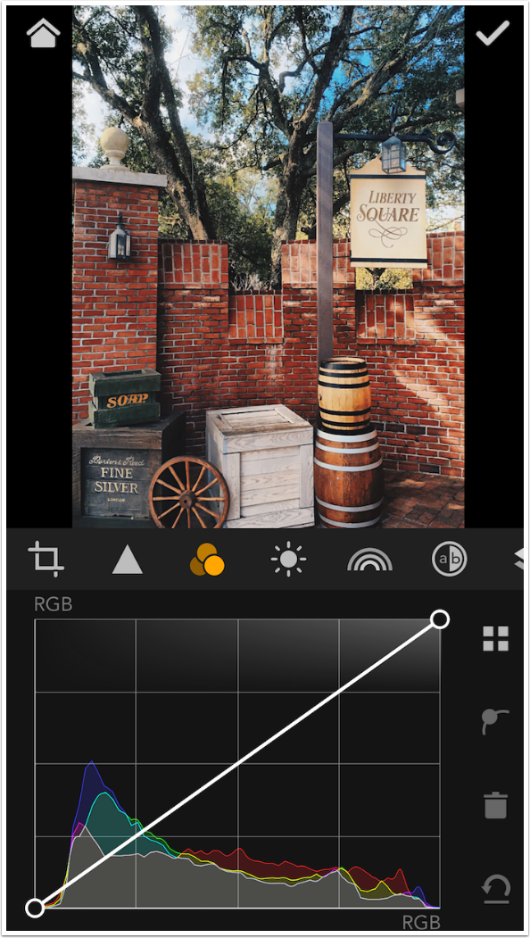
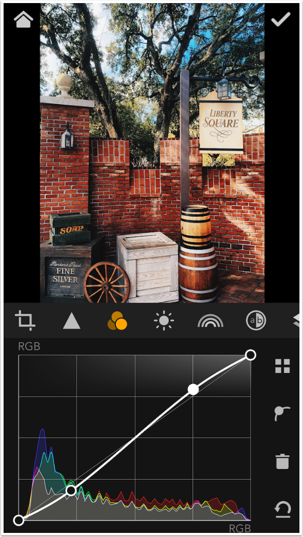
You can adjust any part of the curve by placing a point on the curve and moving it up or down. You can place the point by tapping on the curve itself, or by tapping the image over the area you want to adjust. In the screenshot below, I tapped in the light part of the sky and the point was placed at the upper right.
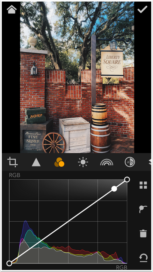
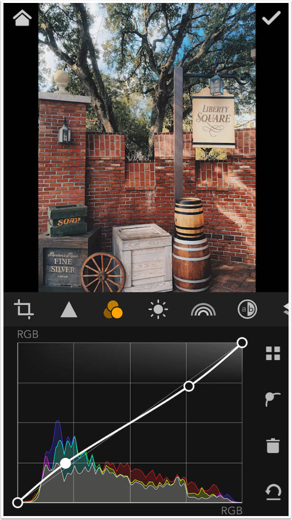
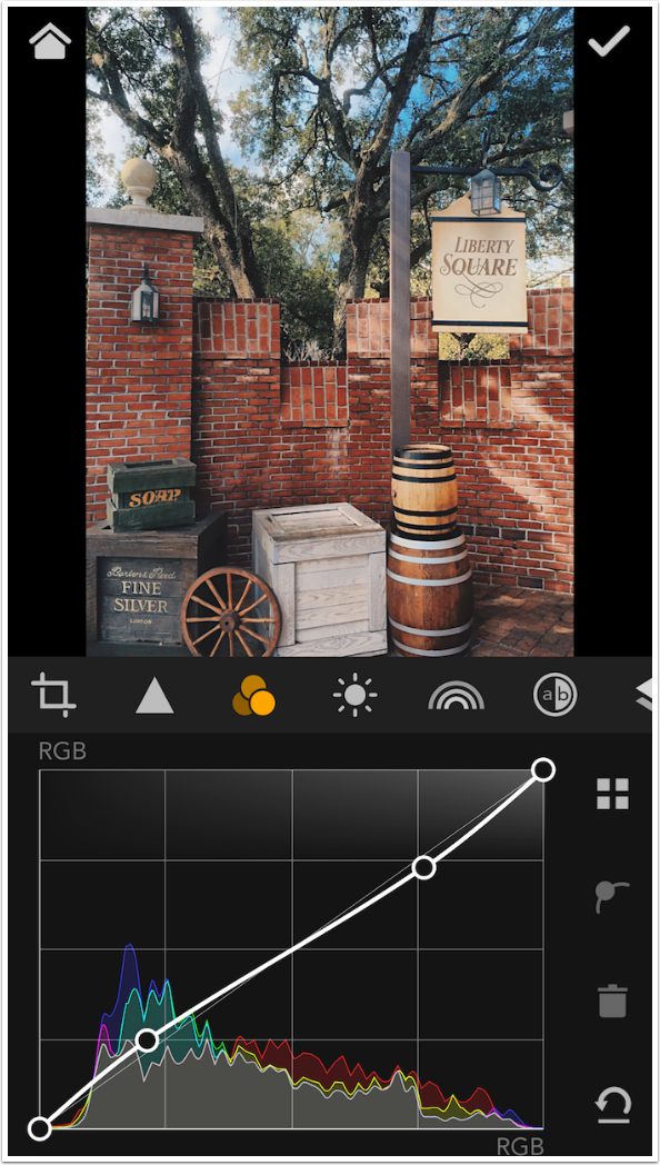
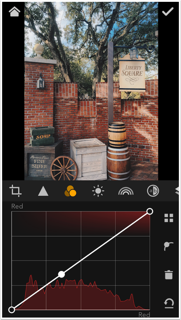
If I don’t adjust the placed point, then tapping elsewhere on the image establishes a new point and discards the non-adjusted point. Below I tapped on the brick and got a point in the absolute center.
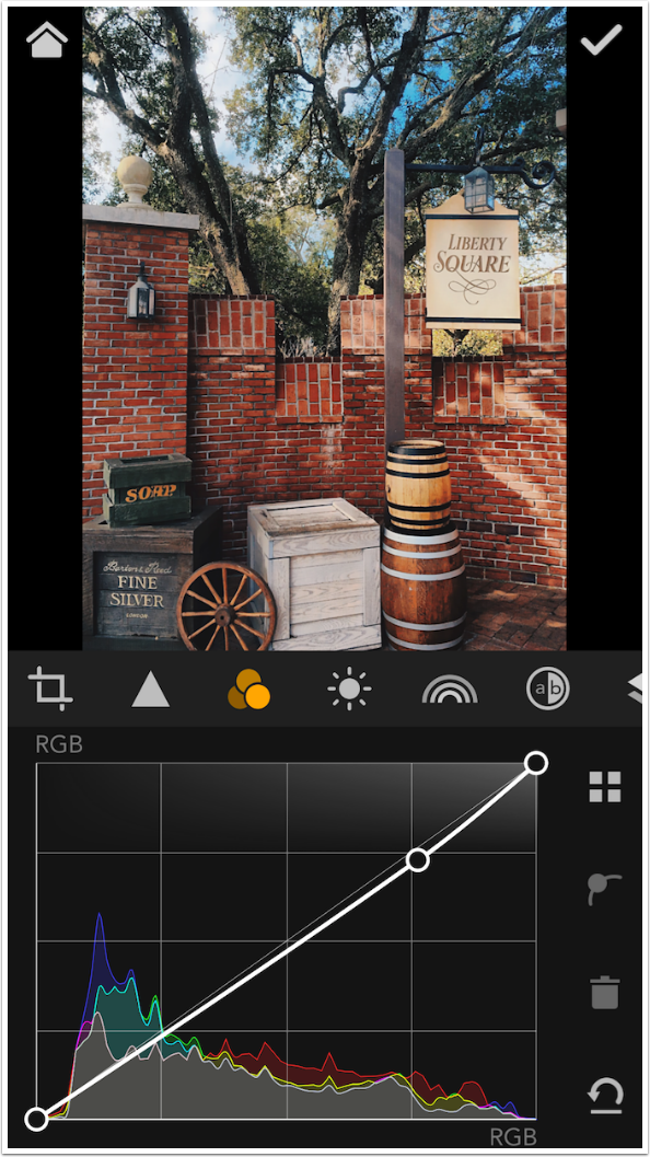
Then I tapped in the darkest area above the wagon wheel and the point is in the shadows, at the lower left.
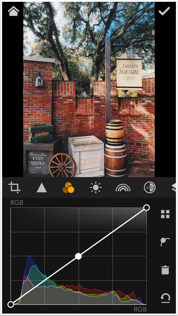
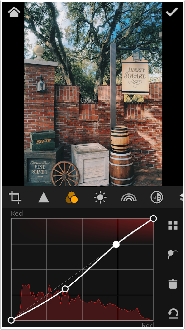
As points are moved downward on the RGB curve, those tones symbolised by that point are made darker. Points moved up make tones lighter. Below is a standard “S’ curve created by tapping at the shadow end of the curve and pulling it down slightly, and tapping at the highlight part of the curve and pulling it up. If you make the whites lighter and the blacks darker in an image, you are increasing contrast. To put it another way, if you increase the slope of the curve and make it steeper, then you are increasing contrast.
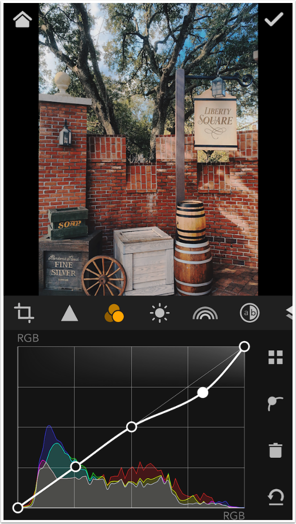
An “inverted S” curve, shown below, decreases contrast and makes the image washed out. As you can see below, minor tweaks to the RGB curve will make a large difference.
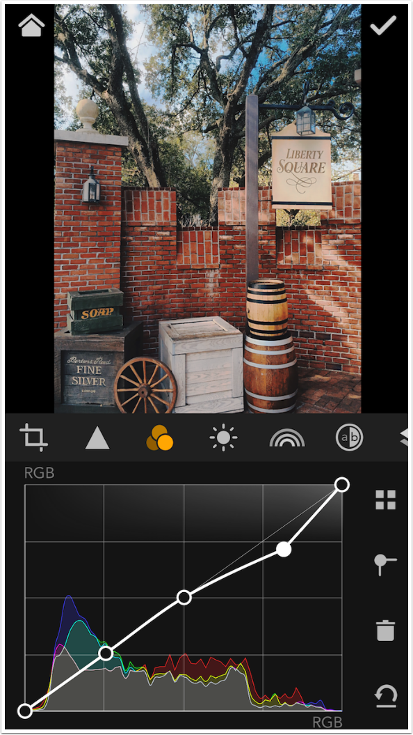
There are four buttons to the right of the curve. The top one, the four blocks, takes you back to the Kit so you can select another Curve. The trash can deletes the selected point from the curve, as shown below.
The arrow with the line is Undo. I used it below to add back the deleted point.
The curve with the dot is an interesting feature. Below I’ve established three points on the curve in addition to the required endpoints. I pull the rightmost added point down and a smooth curve is formed. As you get further away from the changed point, the change lessens gradually, giving a natural look to the change.
However, if I tap the Point Curve button, the smooth curve changes to an abrupt angle. This makes the change more abrupt also. You can get some interesting results by squaring off your curves, but I leave it to you to explore it further. That’s just too much for this series to try to cover.
Below I’ve tapped the four squares to return to the Kit.
Below is the Red curve. The flat line represents exactly the amount of red in the image. If there was no red at all, you would still see the straight line from the bottom left to the upper right. Placing points on this curve and moving them will increase or decrease the amount of red in the corresponding tones.
I want to reduce the red in the bricks, so I tap on the bricks to establish the point on the curve.
By pulling down slightly on the point, I reduce the red in the bricks. You will see another point higher up on the curve. Sometimes you will want to “anchor” points on the curve. If I had just established the single point and moved it down, then every pixel in the image would be affected by the resulting smooth curve from the top to the bottom. By establishing another point on the curve that is not moved, the amount of red in the brightest tones in the image is not changed at all.
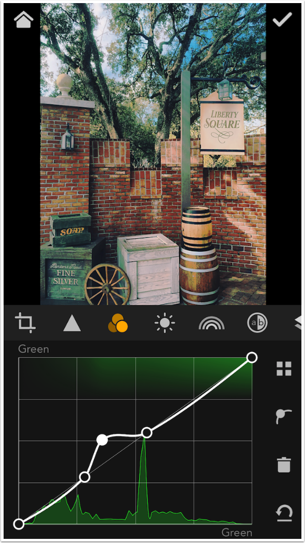
A more dramatic example of establishing anchor points is shown below. I changed to the Green curve and tapped on the green box at the bottom left of the image. I then established anchor points on either side of point I wanted to change. By pulling up that point I made those greens in the lower midtones even more green, wherever they occurred in the image. (See the shadows on the white box, and the formerly gray pole, and see how green they’ve become.) A promised change to allow for masking in a future release of MaxCurve will help pinpoint changes to a portion of the image.
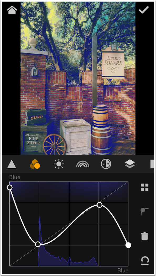
I discarded the Green change by tapping undo until all points (save the endpoints) were removed. By creating an inverted S curve on the Blue curve, I can do some toning. The curve has more blue in the shadows (cool shadows) and less blue in the highlights (warm highlights).
You can move endpoints also. As you might imagine, moves that drastically change the slope of the curve will drastically change your image.
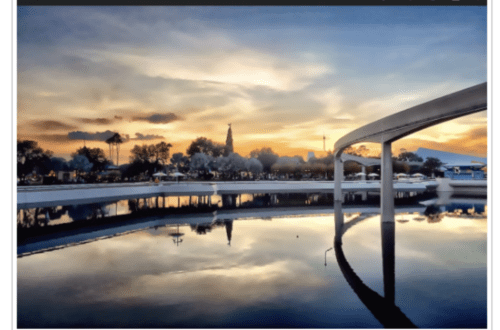
We will leave the image we’ve been working on for the next article. Below you will see an image I modified with MaxCurve. In iColorama, I used two circular masks to blend the changed image with the original. Inside the circles is the original image. Outside the circles you can see that I lowered the contrast with a shallower slope on the RGB curve. I also increased the red in the shadows to warm them.

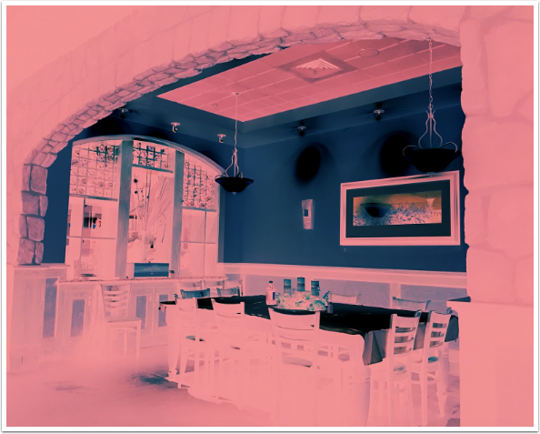
And, of course, MaxCurve can make major changes also. By pushing the black point of the RGB curve all the way up, and the white point all the way down, you can create a negative image. I left the black point somewhat below the top so blacks would be gray rather than white. Then, when I increased the red in the shadows, it tinted the gray pink. That’s how I got this coloured negative.
I’m trying to accomplish two things in this series of tutorials on MaxCurve. The first, of course, is to show you how to use this rather well-designed app. The second is to help you “get over the hump” (pun alert!) on your “learning curve” on curves. If you are interested, there are multitudes of online help files and tutorials on curves that will give you the further knowledge you crave. But I hope by the end of the series you will know a little more about curves than you did before and lose all fear of them. They really are a subtle and efficient way of editing your images. Until next time, enjoy!
Donating = Loving = TheAppWhisperer.com
TheAppWhisperer has always had a dual mission: to promote the most talented mobile artists of the day and to support ambitious, inquisitive viewers the world over. As the years passTheAppWhisperer has gained readers and viewers and found new venues for that exchange.
All this work thrives with the support of our community.
Please consider making a donation to TheAppWhisperer as this New Year commences because your support helps protect our independence and it means we can keep delivering the promotion of mobile artists that’s open for everyone around the world. Every contribution, however big or small, is so valuable for our future.
Jerry Jobe
Never content with just scratching the surface of what an app can do, Jerry Jobe decided to pass on what he learned about imaging apps to others. He’s constantly trying to figure out just what tools other artists have used, and trying to incorporate them into his own work, in an attempt to find his style. He’s written tutorials on over 145 apps so far, which you can find (along with his Song of the Day entries) at http://enthusiasmnoted.wordpress.com/ He lives near Atlanta, Georgia, where he also finds a creative outlet in acting and directing in community theater.


One Comment
Lash
Thanks, Jerry. I purchased MaxCurve several weeks ago, and have begun to try it out; your tutorial will make the learning process more efficient. — Once they add masking, this will be powerful indeed!