Mobile Photography / Art Tutorial – Popsicolor: Tasty, but Satisfying?
We are delighted to publish Jerry Jobe’s latest mobile photography/art tutorial for our reading and viewing pleasure. This time Jobe takes a look at the app Popsicolor by Tinrocket. Read Jobe’s thoughts as he puts it through them through their paces (foreword by Joanne Carter). Take it away Jerry…
Popsicolor retails for $2.99/£2.29 and you can download it here.
“I decided to cover yet another Tinrocket app this week after last week’s look at This and Waterlogue. Popsicolor is the Tinrocket app I’ve been using the longest, and probably my favorite of the bunch. That does not mean I unreservedly recommend Popsicolor, as you’ll see when we move through the operations of the app. Popsicolor is a universal app which works in portrait mode on both the iPhone and iPad, and in landscape mode only on the iPad.
So what does Popsicolor do? Like Waterlogue, it gives a watercolour look, but it limits the colors to one or two colors that the user assigns, rather than taking the colors from the original photo”.
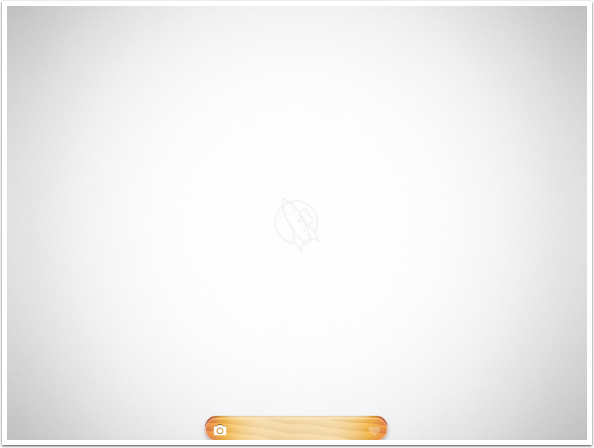
The user interface is much like Waterlogue. The user gets a blank screen, and the only option immediately available is the Camera, which is used to load an image.
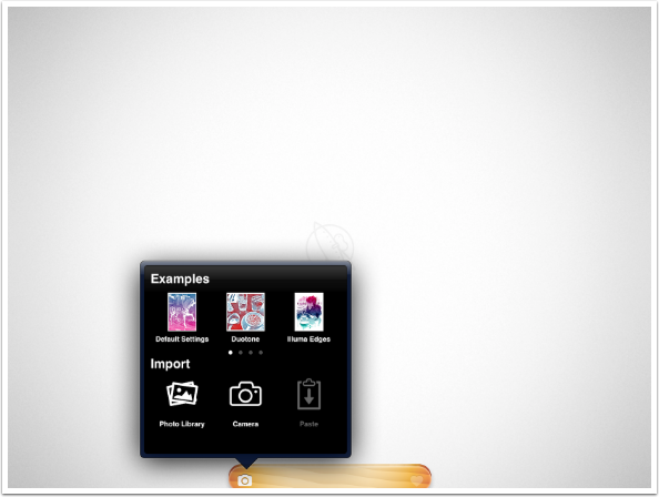
The options available for loading an image are the Photo Library, the Camera, Paste an image from the clipboard, or load an example image for experimentation.
I, as usual, will load my image from the library. Popsicolor works best with uncomplicated images, so I will work with a portrait.
You will see below that three new icons were added at the bottom: the Brush, the Sunglasses, and the Target. (The Heart icon saves/shares your image.) The Brush icon allows you to choose your colors. One color is chosen with the top row of popsicle colors; the other is chosen at the bottom. Because the same color is chosen (marked with a checkmark) at both the top and bottom, Popsicolor uses a single color in this image.
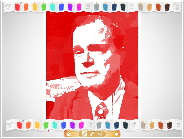
When I tap different colors on the top and bottom, Popsicolor defaults to a gradient from the top color to the bottom color. The properties of the gradient can be changed using the Target icon, which will be shown later.
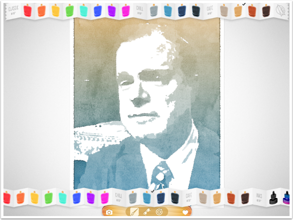
Out at the right end of the bottom color selector are some additional icons: Inks, Swap and Shuffle.
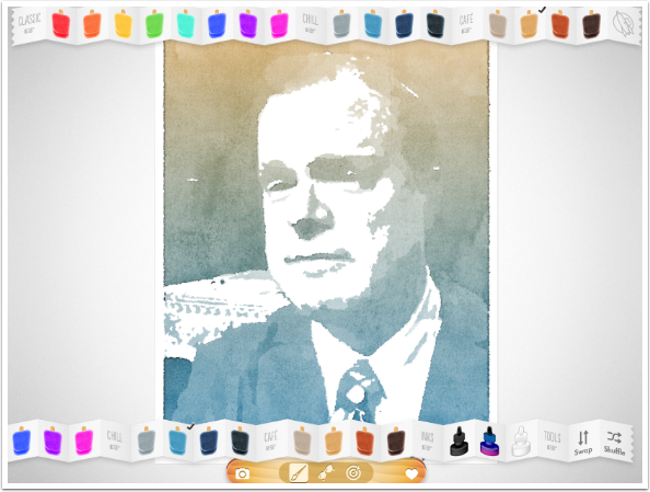
Swap simply swaps the top and bottom colors, as shown below.
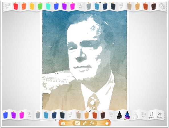
Shuffle randomly selects colors for the top and bottom. The Ink setting currently in effect will not be changed.
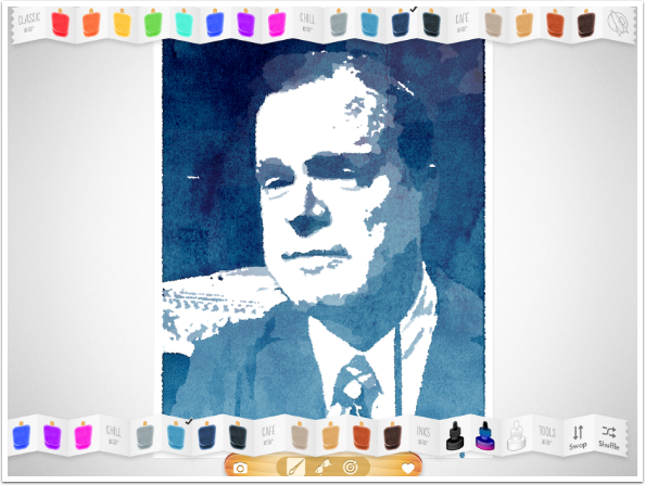
The Ink settings add ink on top of your watercolour. The amount and placement of ink cannot be adjusted directly, but changing the look of the image with the Sunglasses icon will change the Ink. Black Ink is a bold statement that overruns the border.
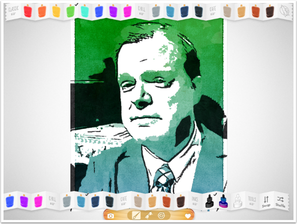
White Ink washes out the colors significantly.
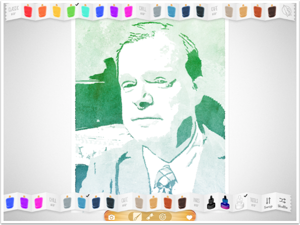
My favorite is the middle setting – the Coloured Ink. The Ink applied is a darker tone of the two colors selected for the wash.
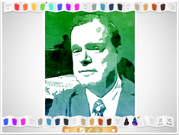
As I said, the distribution of Colors and Inks cannot be adjusted directly. There are no sliders in Popsicolor. However, if you change the distribution of lights and darks in the image, you can influence the Colors and Inks. Changing the brightness and contrast of the underlying image is done with options under the Sunglasses icon. The options are displayed along the bottom of the workspace.
By default, the image is shown with the Classic “Natural” setting, shown to the left of the options. By changing the option to a darker option under the Even group, all the highlights are taken away and none of the white of the paper shines through.
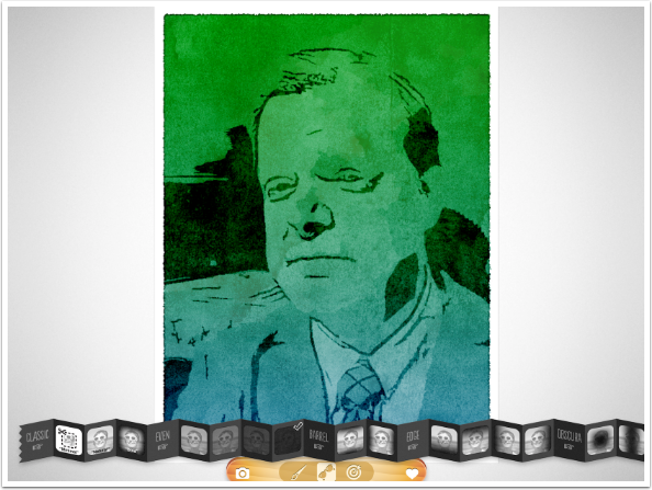
Other Sunglasses option will darken or lighten the edges or center of the image. Below is a darkening of the left and right edges using the second option of the Barrel group.
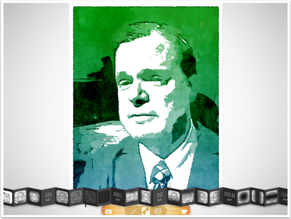
The Obscure options will darken the center of the image.
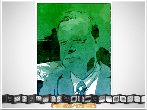
Illuma options will lighten parts of the image, adding more paper white to the “watercolour”.
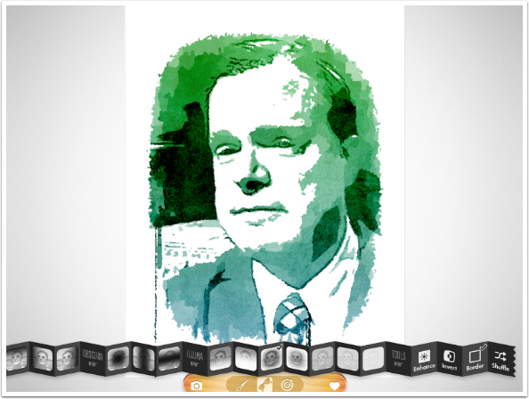
A variation on Illuma is found all the way at the left of the options under Classic: Minimal. It whitens a ragged border around the edge of your image. It attempts to determine the subject of your image and highlight it. I think it does a pretty good job with this portrait.
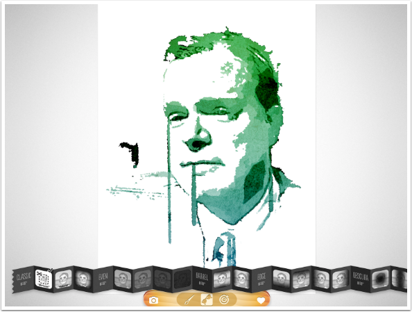
At the right end of the options are Enhance, Invert and Border. Enhance increases local contrast in the underlying image, which means you have smaller areas of white and dark. Notice how the lines on the forehead are picked up when I Enhance the image.
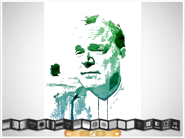
Because the Minimal setting brings the edge in beyond any border, I have to change to “Natural” to illustrate the Border option. Border defaults to a slim border with rounded corners, as seen below.
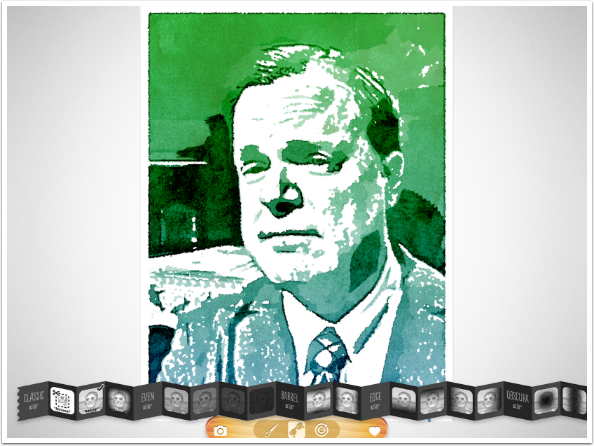
Invert swaps the light and dark of the underlying image, but leaves the white Border in place.
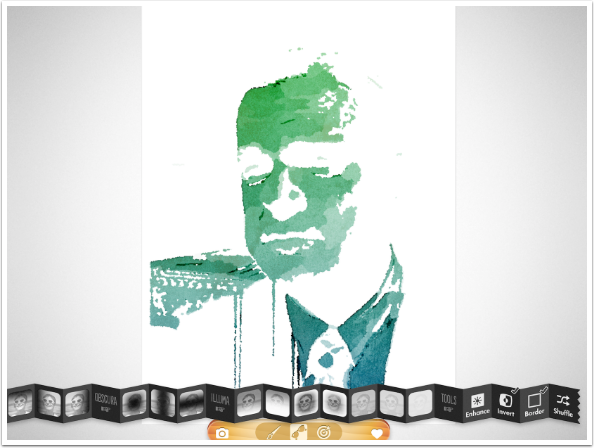
Switching the Border off allows the colors to go all the way to the edge of the image.
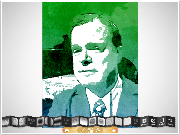
By default, the colors are applied in a gradient from top to bottom. This can be changed using the options under the Target icon.
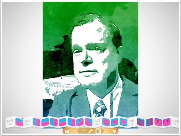
Below you’ll see a Linear gradient from left to right.
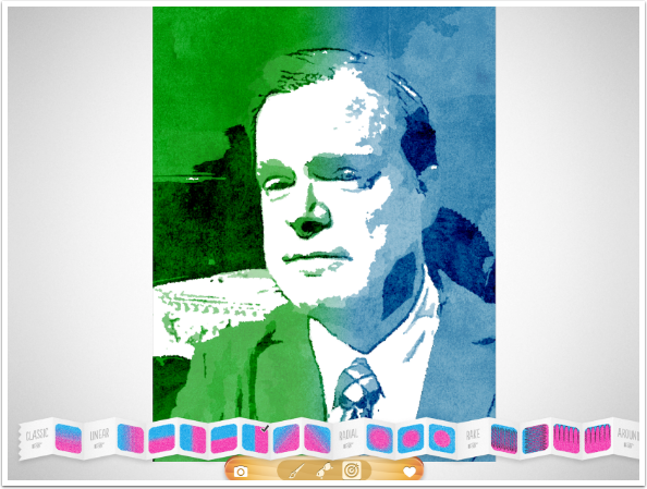
Next is a Radial gradient with a hard edge.
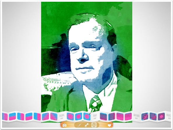
Many of the gradients have a distinct pattern, like the Rake gradient below.
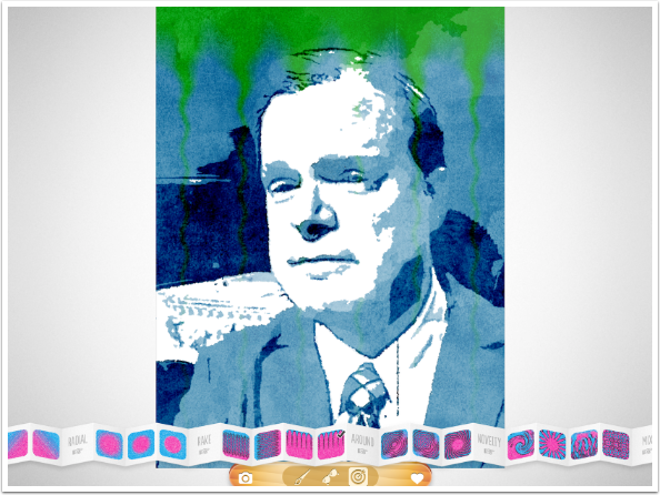
The Novelty pattern shown below is not as obvious, since it’s an irregular pattern.

There are two additional options under the Target icon. The first is Mix, which changes the two-colour gradient into a single color by mixing the two colors together. Below I have a blue-green, instead of the separate blue and green that I’ve been working with.
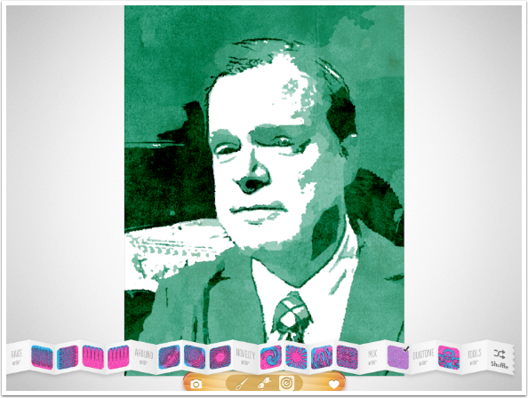
The last option is a favorite: Duotone assigns the top color to the midtones of the image, the bottom color to the shadows, and the white paper color to the highlights.
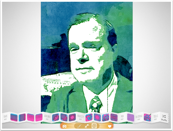
When you are satisfied with your image, you tap the Heart icon to save/share the image.
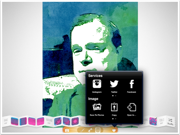
Here’s my finished portrait.

As I said in the beginning, it’s very important to select the right kind of image for Popsicolor. The more complicated the image, the less you’ll like the result. When you only have two colors to work with, and three tones (highlight, which is assigned the paper white, and the two user-assigned colors), then much of the complicated areas will run together, obscuring the detail. I chose an image of a covered bridge over a creek below. It’s hard to tell what the image is without that description.
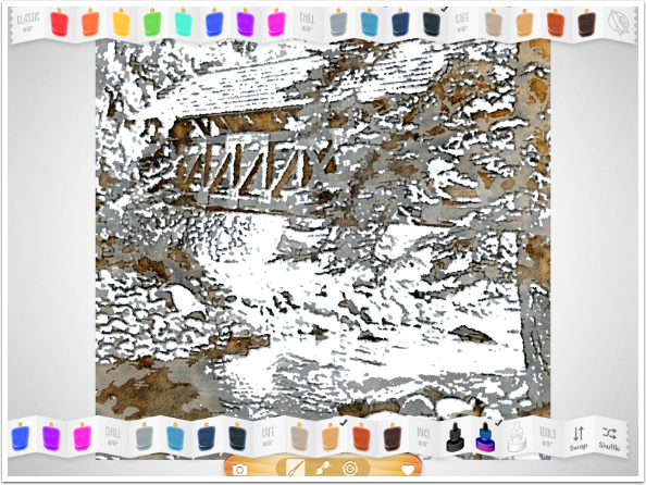
No matter what I do with Color, Ink, adjusting the underlying image, or manipulation of the Gradient, I still get a mess with the complicated image.

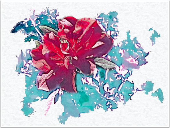
Of course, even the mess that you can get with a complicated image can be fixed with blending other versions into the Popsicolor image. Below I blended a TangledFX version of the bloom, along with a bit of the original, over the Popsicolor background. I also added a paper texture in iColorama, since, like Waterlogue, Popsicolor offers no paper colors or textures.
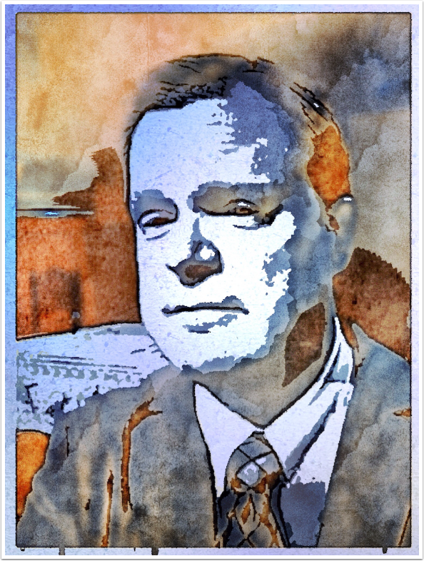
So if Popsicolor offers no paper color or texture, make one yourself. Here’s my portrait, taken into iColorama, where I had a blue gradient over white, with added texture. I used Effects>Blend in iColorama to drop out the white of the Popsicolor paper.
I like and will continue to use Popsicolor, but there’s a lot of room for improvement. The choosing of canned options, rather than using sliders, makes it hard to know what your output will look ahead of time. Is the circle gradient the right size? Are the colors a little too saturated? What if I need the underlying image to have less contrast AND I need the edges darkened? And, most important of all, why can’t I get a paper color and texture other than flat white?
Popsicolor has not been updated since 2013. It is past time for a complete overhaul. I really think that Tinrocket should be looking to help their existing users before going out to find new ones with more recent products like This and Waterlogue.
Until next time, enjoy!
