Mobile Photography – StreetWise Showcase – July 2016
“Seeing is not enough; you have to feel what you photograph” Andre Kertesz
We were struck by the beauty of all the photos submitted to our StreetWise group from around the world (Italy, Belgium, Spain, France, England, USA, Cuba, Israel, Holland, China etc) – such a wonderful international collaboration of photographer’s work!
Thank you so much for participating, posting to our Flickr group, and inspiring us with your photos. We look at all of them with the utmost consideration and it is a very challenging task to choose photos for the showcase from all those that were submitted.
A reminder of our group’s intention and guidelines “We believe that it is important to focus on the key aspects of street photography composition, timing, juxtaposition, catching the decisive moment rather than relying on too much apping. We therefore feel that apping should be kept to a minimum cropping, tweaking exposure, color, adding a grain or texture is ok but we would like to see you steer away from overly app’ed images that are more art oriented or painterly.”
If you are a mobile street photographer, please consider joining our growing community.
* Flickr Group (for weekly showcase submissions)
* Facebook Group (for information sharing/discussions)
Many congratulations to the following artists for being featured in this showcase including:
Vanessa Vox, Andrew B White, Donna Donato, Ger van den Elzen, RK, carlein, Jo Sullivan, Connie Gardner Rosenthal, Pat Brown, Louise Whiting, Gina Costa, Ocean Morisset, Paula Betlem, Giulia Baita, Roy Savoy, Luison, Rene Valencia, Paul Yan, Nick Kenrick, Karen Axelrad, Rosanna Cappiello.
‘Wind’ – @lupoeluna78 – Rosanna Cappiello
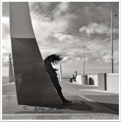
This photograph instantly draws the viewer in with its strong composition. While we are transported to the ocean, there are architectural elements such as the column in the foreground the main subject is leaning against that anchors the image, creates perspective but also acts as a wonderful juxtaposition to the whimsy depicted. Our eyes travel along a concrete wall with light posts that move into the distance and again our eyes meet with something whimsical – a dreamy, cloud dotted sky. The main subject himself appears to almost merge into the column but for his hair which is being blown by the wind and flying up, up and away – illustrating once again the wonderful duality present in this photograph. One is truly transported! Nice, Rosanna!
‘Anomaly’ – Karen Axelrad
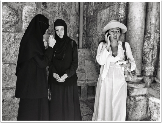
One can’t help to smile when looking at Karen’s apply titled, ‘Anomaly’. There’s a great sense of the incongruous as two worlds occupy the same space. A wonderful marriage of the traditional and modern in the subject of the nuns, who are in customary black garb and the lady next to them, who is dressed all in white. What adds to this juxtaposition is the lady in white is clearly having an animated conversation on her cell phone while the nuns seem entirely engrossed in their own world one’s pose even seems that of a religious statue. However, if one looks closely, one of the nuns is sporting a rather cool pair of shades. The composition is strong for its simplicity and colors yet it’s chock-full of these marvellous details including the lovely architectural niche the three subjects are standing in. Well seen and captured, Karen!
‘Is it you? Is it her?’ – @Paul Yan
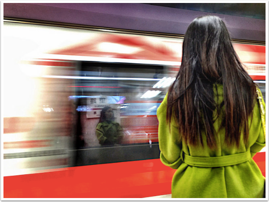
Paul’s photo immediately grasps your attention with its bright neon complementary colors that pop from the frame and the blurred movement of the train speeding by. The composition of this image is superb. With the bold parallel red and purple lines broken by the green of the subject’s coat, as well as, the vertical lines of the woman’s hair to the right of the frame.
As one looks more carefully, the details begin to reveal themselves – most strikingly, the reflection of the woman in the window of the fast moving train.
Of course, the incredible thing about photos such as this, is that there is no time for planning – within a split second, the beauty of this moment was captured. Well done, Paul!
‘Old Havana Series’ – Nick Kenrick
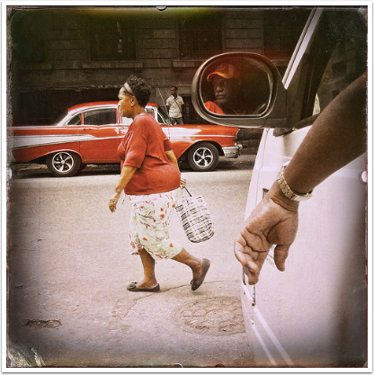
Nick has captured a moment in old Havana beautifully with this complex and yet simple photo. What one may notice initially is the red color of both the woman and the vintage car against the warm neutral tones of the rest of the image. The hand in the foreground draws you into the scene where there is a well balanced composition of the three figures – foreground, mid-ground and distant. The red of the driver’s hat and shirt, and his expression, adds to the delight of the photo. Because the composition is so strong, this photo could have been just as powerful in black and white. As is, the colors are predominant, giving us a taste of Cuban life and yet perhaps using a truer color palette would have been a great potential also. There are so many ways one can visualize this superb capture, which adds to its charm and strength. Beautifully, seen, Nick!
StreetWise Video Showcase
Donating = Loving = TheAppWhisperer.com
Bringing you (ad-free) TheAppWhisperer.com takes hundreds of hours each month and hundreds of pounds to sustain. If you find any joy and stimulation here, please consider becoming a Supporting Member with a recurring monthly donation of your choosing, or possibly making a one-time donation. This is a not for profit website and one that can only grow with your support.
[seamless-donations]

